Launched · impact evaluation pendingProduct design · Jack WestinEdTechAug – Oct 2026
What did I miss?
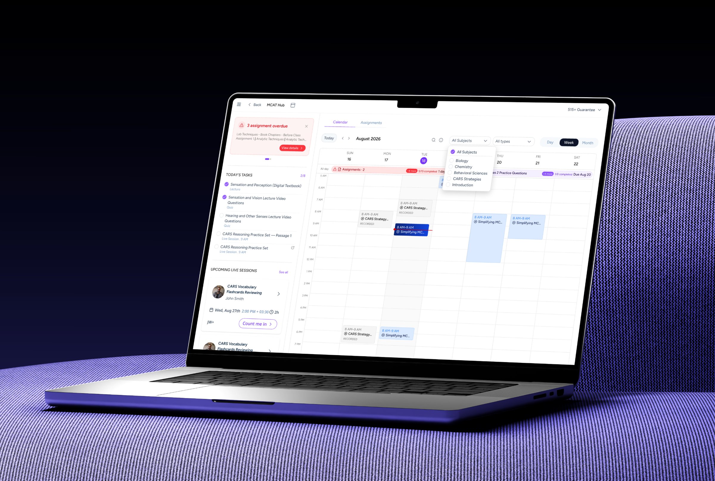
Preparing for the MCAT means working toward a date that doesn’t move: exam day. I designed a Calendar that brings course commitments into one place, so students can see what’s ahead, what they’ve missed and what to focus on next.
Problem
Students work toward a target exam date. The dashboard already showed course progress, assignments and live sessions, but in separate sections, with no view of how they fit across days and weeks.
Goal
Help students answer: What’s due today? What’s coming this week? What have I missed?
My role
Product designer, end to end, working with a PM and a front-end engineer.
Status
Launched for Live course students. Impact hasn’t been evaluated yet.
01 · The challenge
An exam date, but no clear view of the weeks ahead.
Students preparing for the MCAT have a target exam date. Along the way, their Live course sets its own instructor-defined deadlines for assignments and live sessions, and keeping track of all of it isn’t always straightforward.
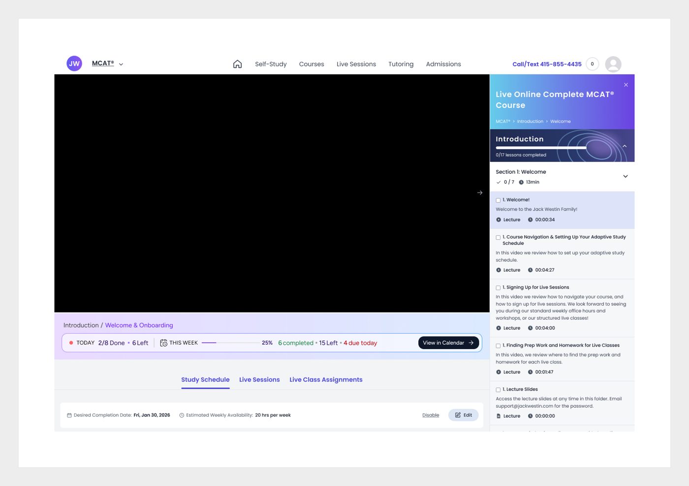
The existing Jack Westin dashboard already brought together course content, assignments and live sessions. But these activities sat in separate sections, without a unified view of how they fit into a student’s day and week.
010203
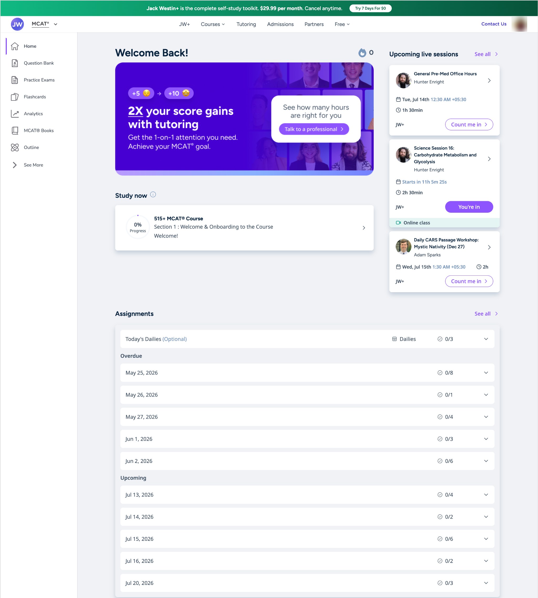
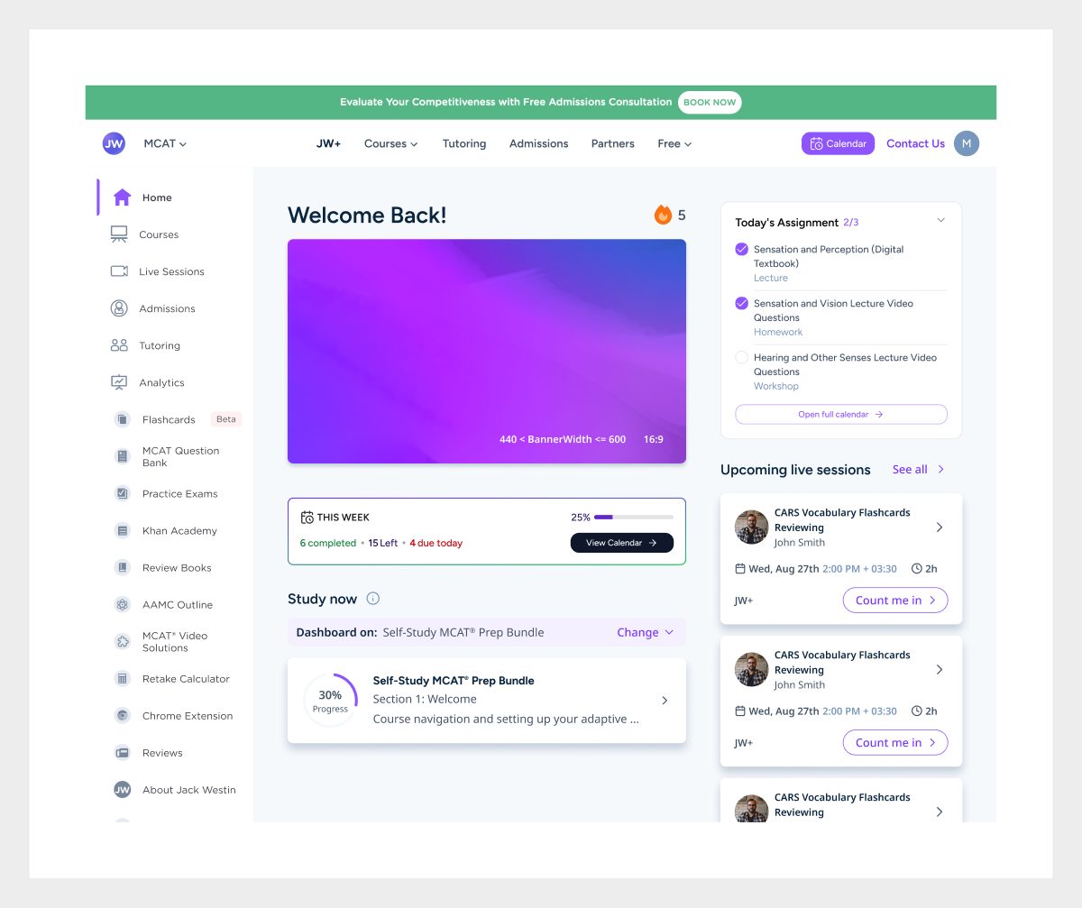
The previous dashboard · top of the page. Topic insights, study by subject and flashcards sat further down.
01Study nowStudents could open course content and track their progress.
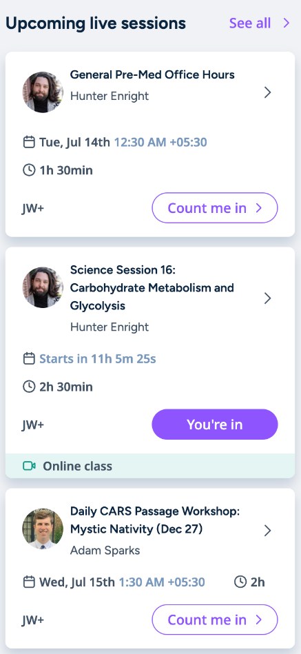
02Live sessionsUpcoming classes appeared separately in the sidebar.
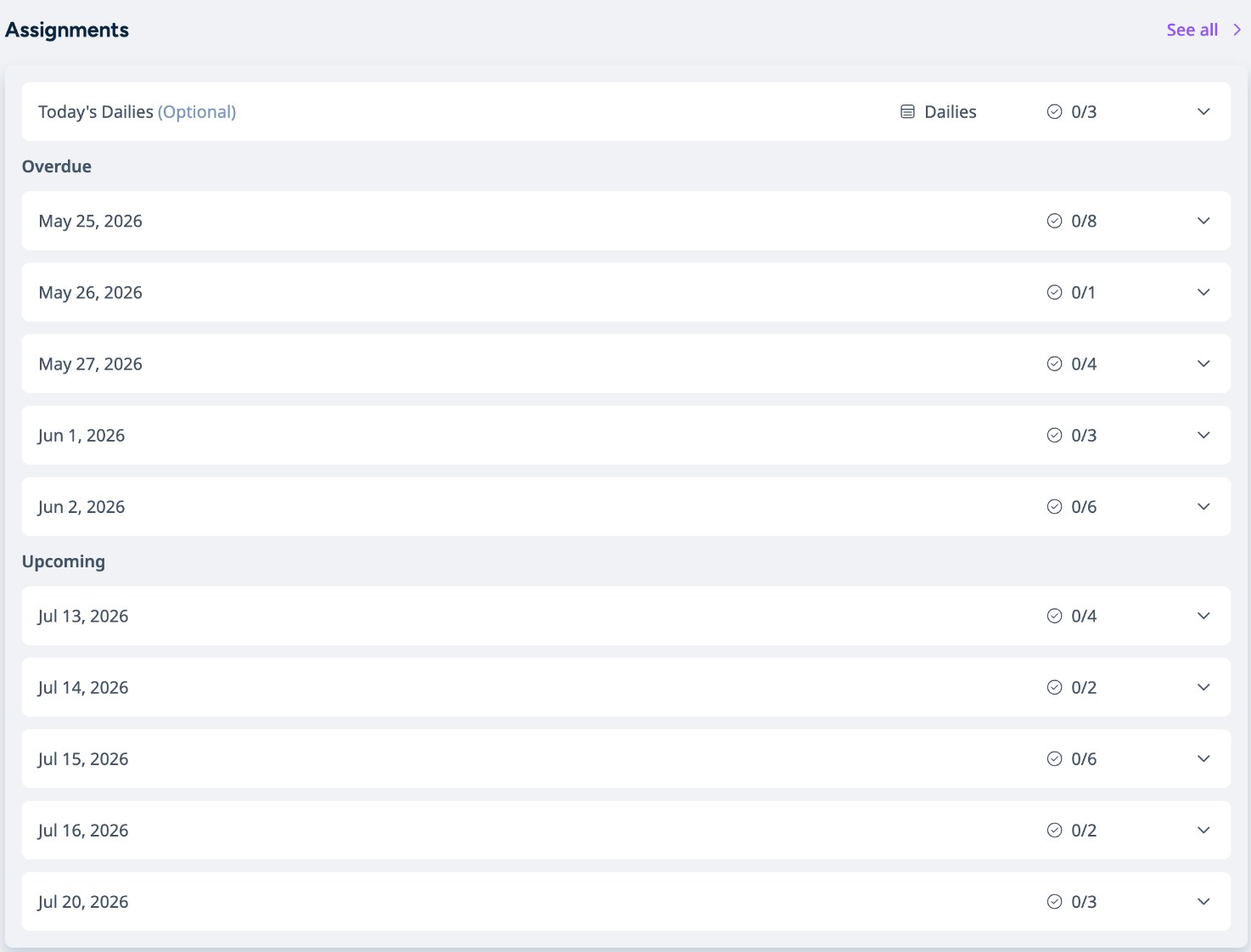
03AssignmentsGrouped into Overdue and Upcoming lists by date, but it was hard to see how the workload spread across days and weeks.
02 · live sessions in the sidebar
03 · assignments as collapsed date lists
Picture a student returning after a few days away. The information was all there; the hard part was understanding what needed attention first, what they’d missed, and what was coming next.
The design challengeHow might we organize existing course information into one clear, time-based view?
02 · Understanding the experience
The information existed. It just wasn’t connected.
Before deciding what to build, I mapped how the existing dashboard organized each kind of content. Course progress, assignments and live sessions each had their own section, and nothing placed them on a shared timeline of days and weeks.
Before
Study nowCourse content · progress
AssignmentsOverdue and upcoming, listed by date
Live sessionsUpcoming, in the sidebar
Separate sections on one page. The student connects them.
After
One course scheduleAssignments, sessions and recordings with one completion state
CalendarWhen
AssignmentsWhat next
Dashboard · LearnWhere they already are
One source, shown where each question is asked.
Live course students work to fixed, instructor-set deadlines, and missing a class means finding its recording. So the core questions were about time and status: what’s due, what’s late, and what’s next.
What other calendars taught me
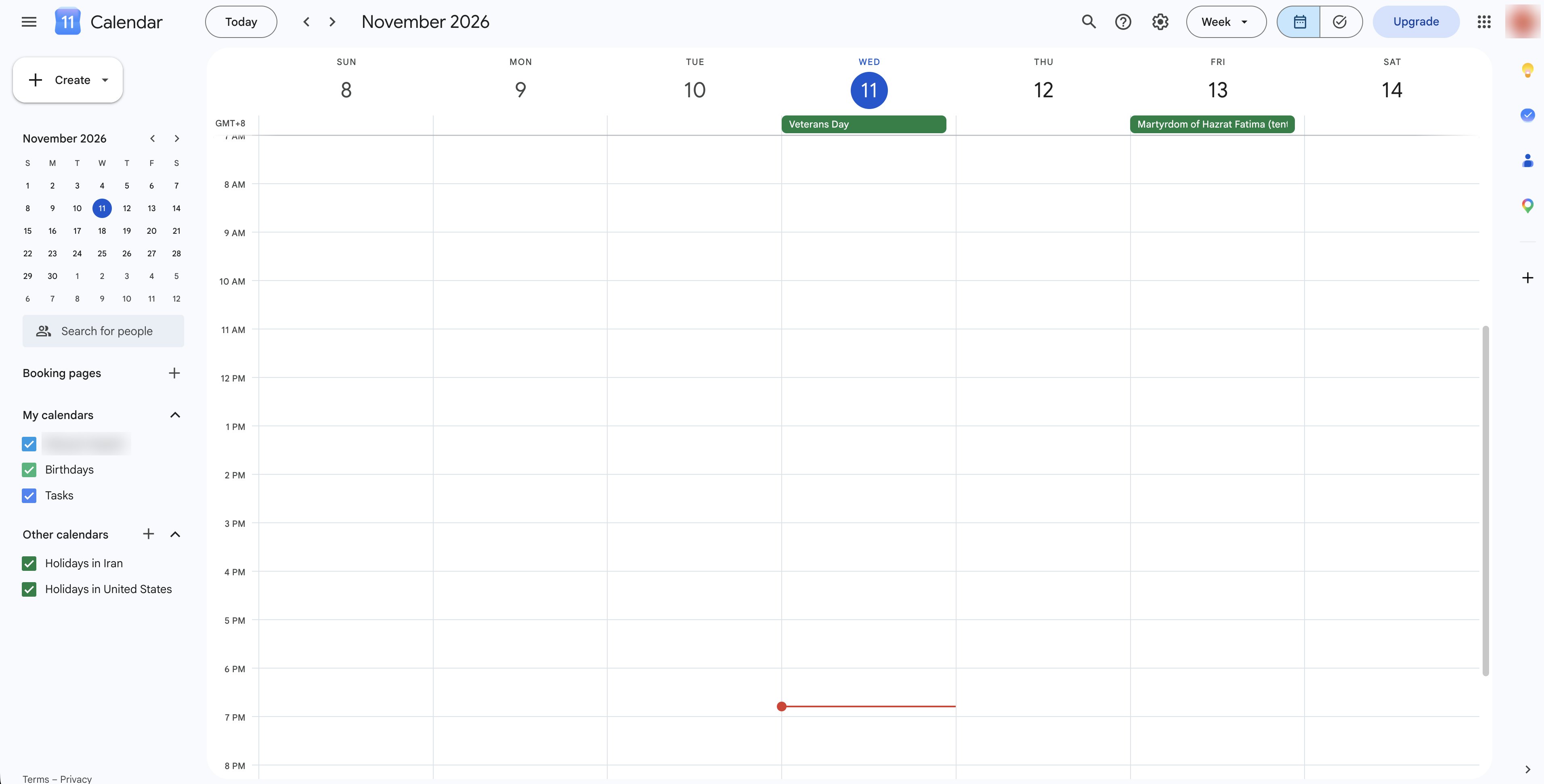
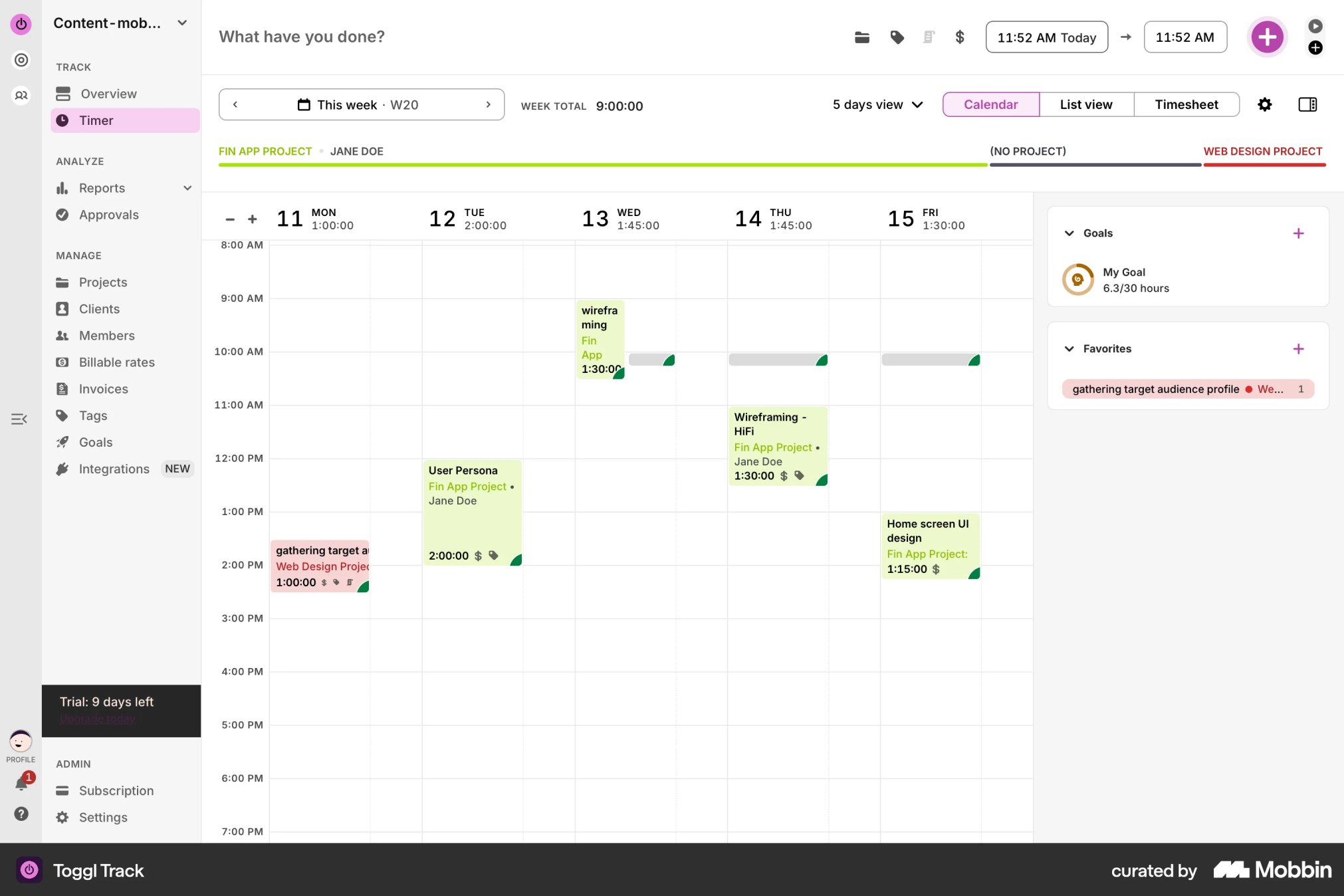
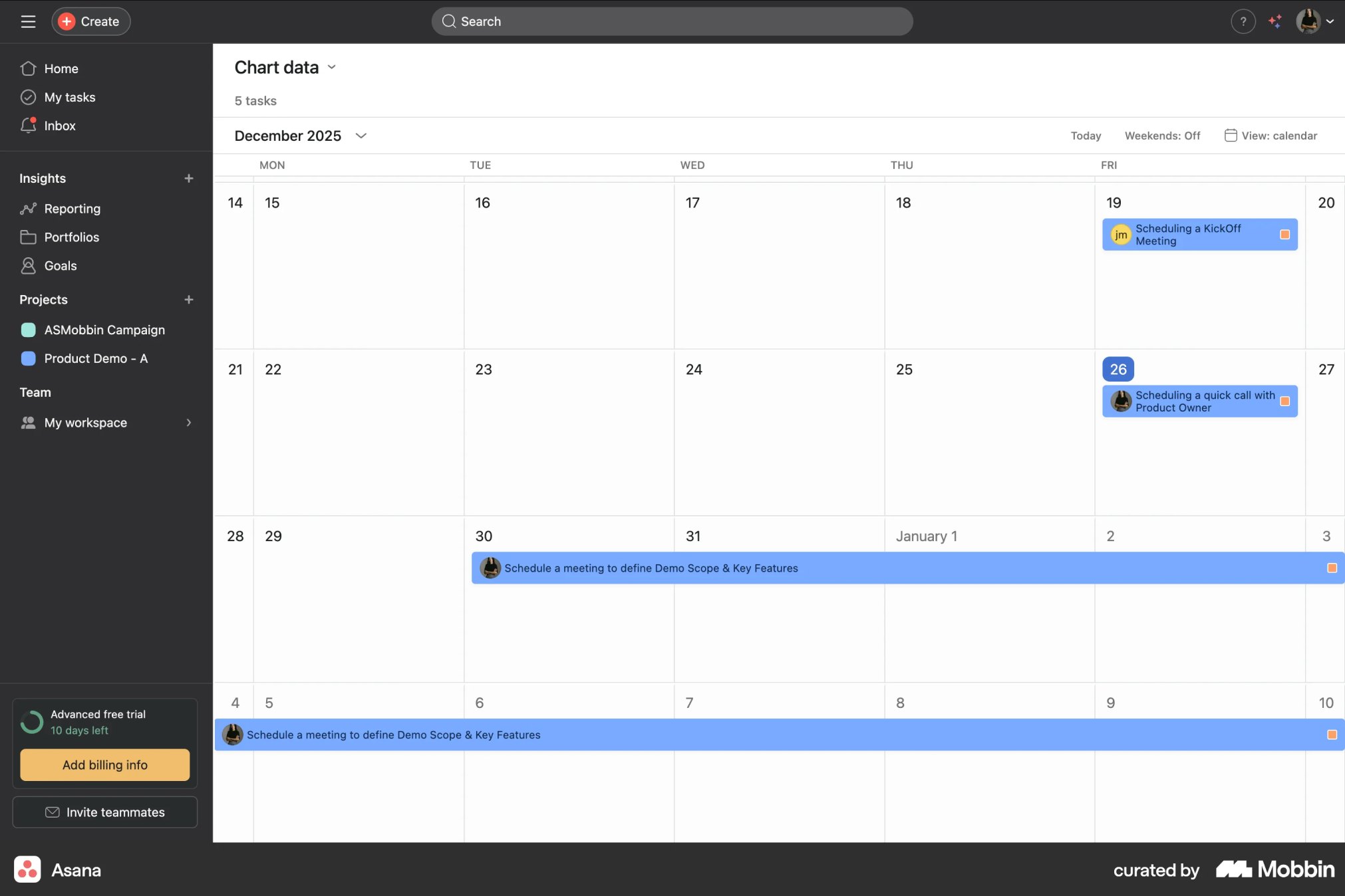
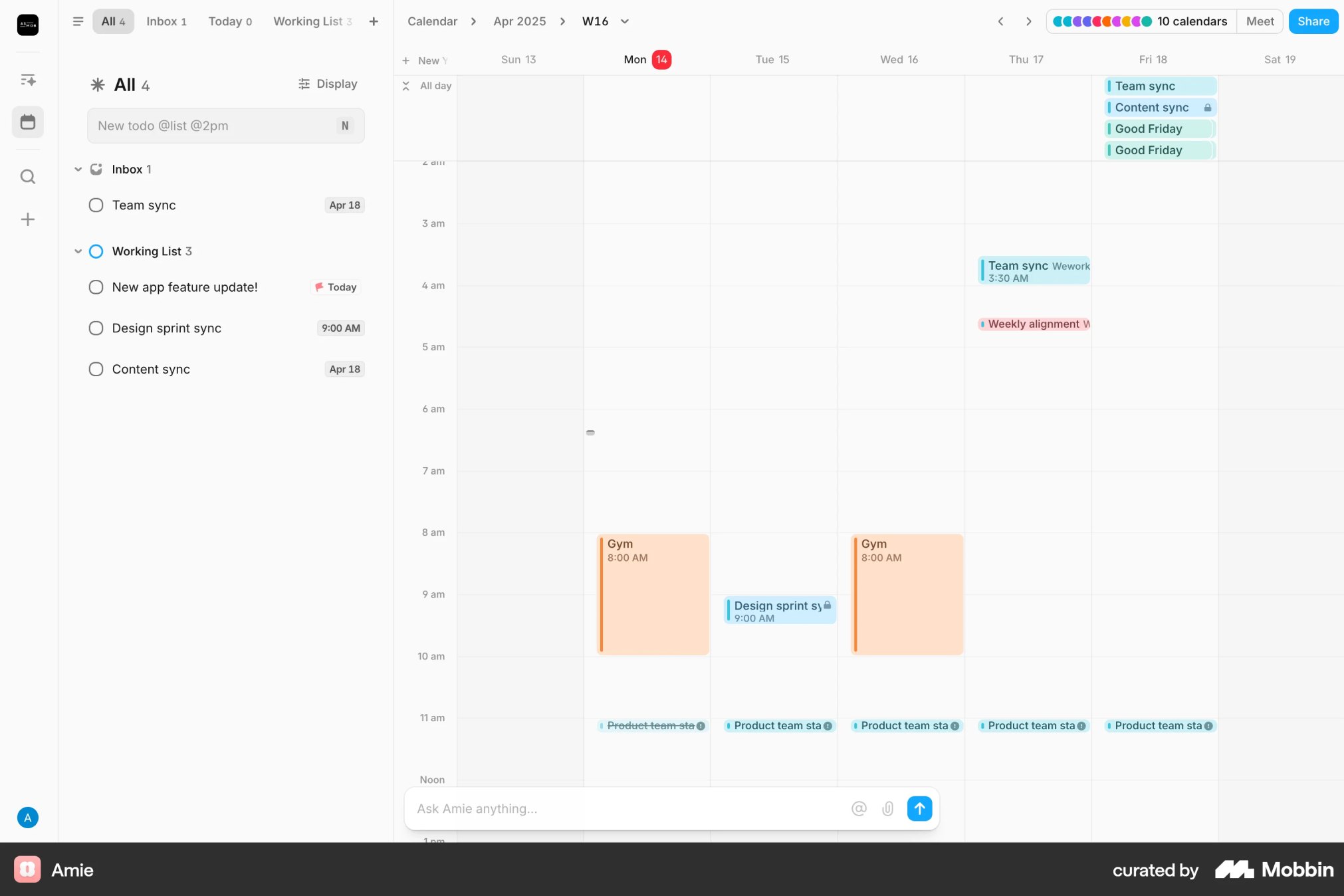
With the problem mapped, I looked at how planning tools handle time and tasks together. I benchmarked nine calendar and planning products; four patterns shaped the Calendar concept.
Familiar week and month navigationGoogle Calendar. I used familiar calendar conventions to reduce the learning curve.A side panel beside the weekToggl Track keeps goals next to the grid. This became the Today’s Tasks sidebar.Multi-day items as barsAsana. This shaped the all-day assignments row.Schedule plus tasksAmie pairs events with to-dos, like sessions and assignments.
The opportunityStudents needed a connected view of their commitments, not another isolated destination.
03 · Making the decisions
How the Calendar took shape.
Decision A
Three views for different planning needs.
Problem
“What do I study today?” and “what’s coming up this week?” need different amounts of detail, which is hard to serve with one fixed layout.
What I decided
Day, Week and Month views over the same schedule, so students zoom in on today or out to the weeks ahead without changing tools.
Trade-off
Three layouts of the same data to keep consistent, including how assignments and sessions show at each zoom level.
{{cvA.label}} · {{cvA.cap}}
Decision B
Separate Calendar and Assignments, keep them in sync.
Problem
A time grid answers “when is class?” but not “what should I work on next?”.
What I decided
Calendar for when, Assignments for what next. Both show the same items and share one completion state, because one screen doing both jobs would have been harder to read.
Trade-off
Two surfaces to keep aligned. Completion status needed to remain consistent across views.
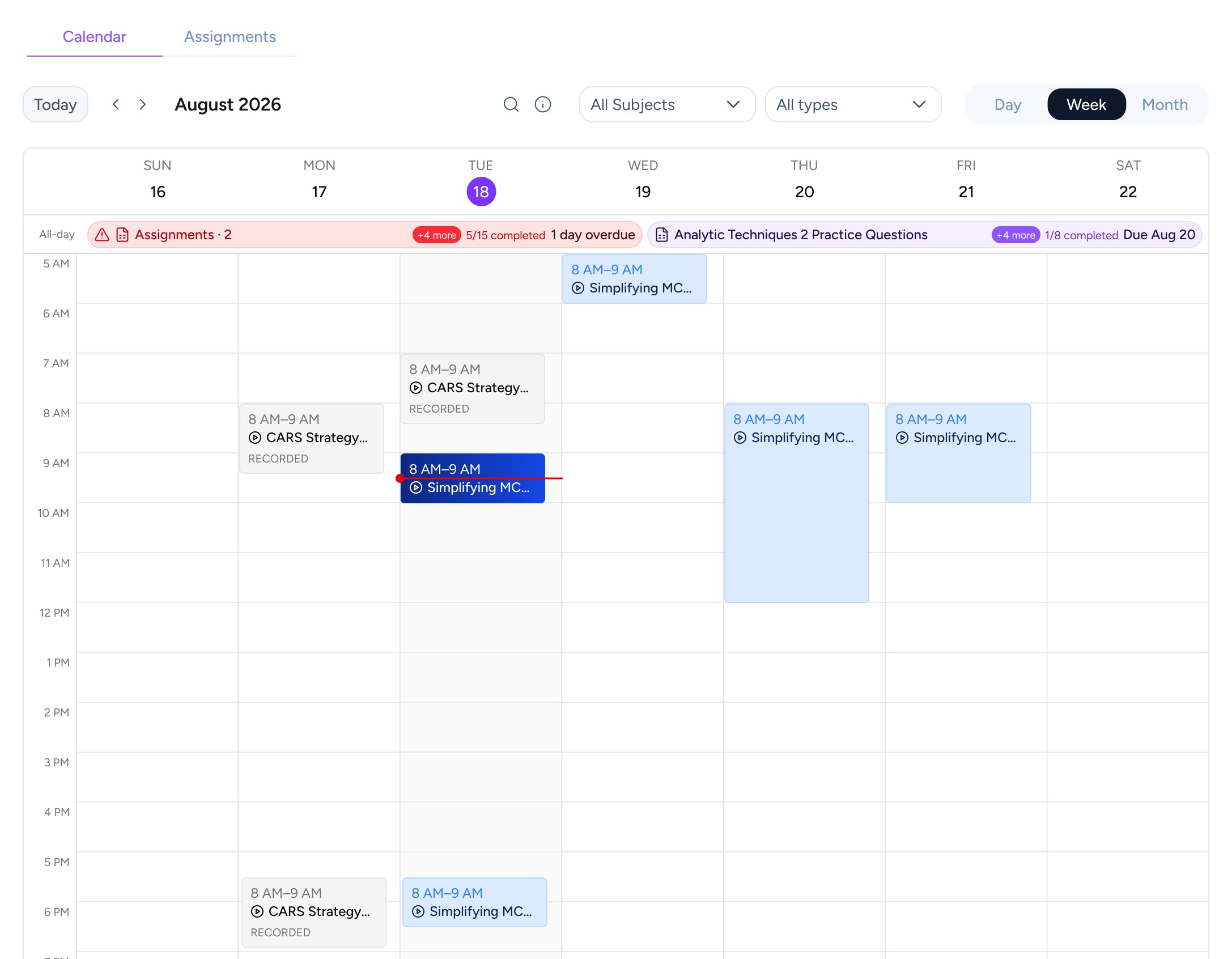
Calendar · when things happen
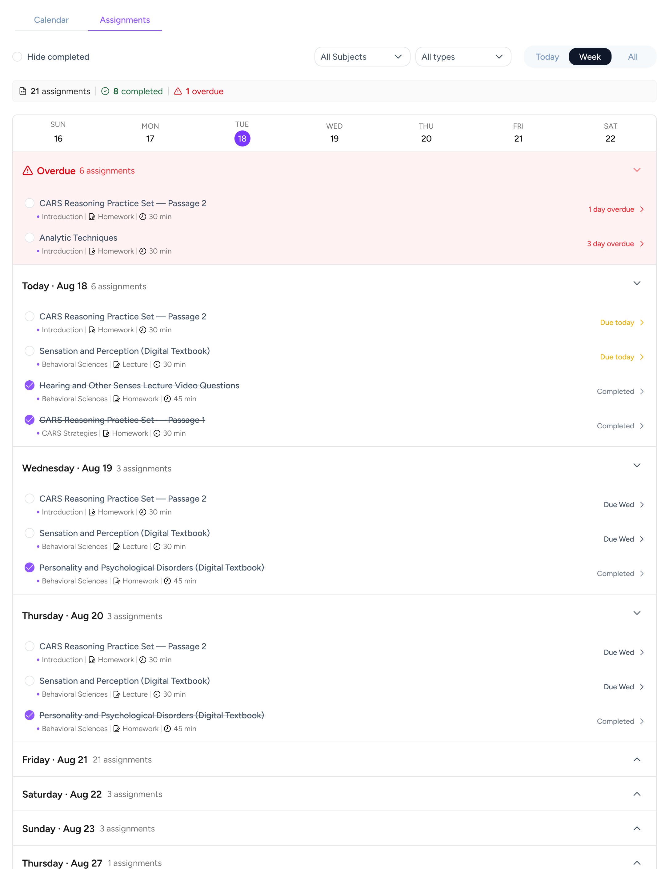
Assignments · what to do next
Decision C
Make overdue work easier to spot and prioritize.
Problem
Overdue work was listed by date, but each date was collapsed behind a completion count, and nothing placed it against the week ahead.
What I decided
Overdue shows in three places, each with one job: status on the calendar, an Overdue group at the top of the list, and a dismissible alert.
Trade-off
More red on screen. I used factual, non-judgmental status labels, like “1 day overdue”, to avoid punitive messaging.
1On the calendarOverdue work turns red in the all-day row and on the month grid, with how late it is.
2At the top of the listIn Assignments, an Overdue group sits above Today, and each item says how many days late it is.
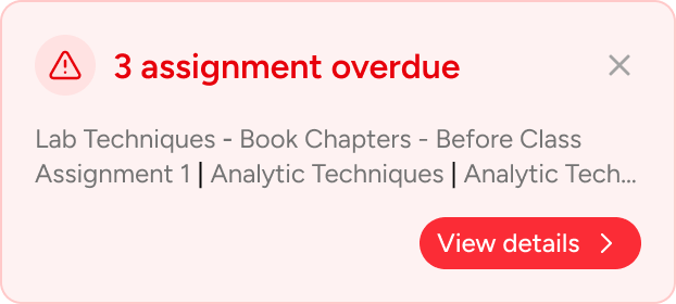
3As an alertA dismissible alert lists what’s overdue and links to the details.
Decision D · made with the PM and engineer
Keep the first release focused.
Calendars often let people drag items to new dates. But Live course assignments have fixed, instructor-set due dates shared by the whole class, so letting one student move them raised real questions about who owns the date and what stays in sync.
Together with the PM and engineer, we chose to keep V1 focused: students can see their assignments and live sessions in one place and mark work complete, but not reschedule course assignments. More complex capabilities, like rescheduling and integration with external calendars, were outside the original scope and could be explored later.
04 · Bringing the experience together
From seeing the schedule to acting on it.
The Calendar works alongside the course pages students already use. Each decision became part of one flow: see what’s ahead, act on what’s next, and stay connected to the course.
01
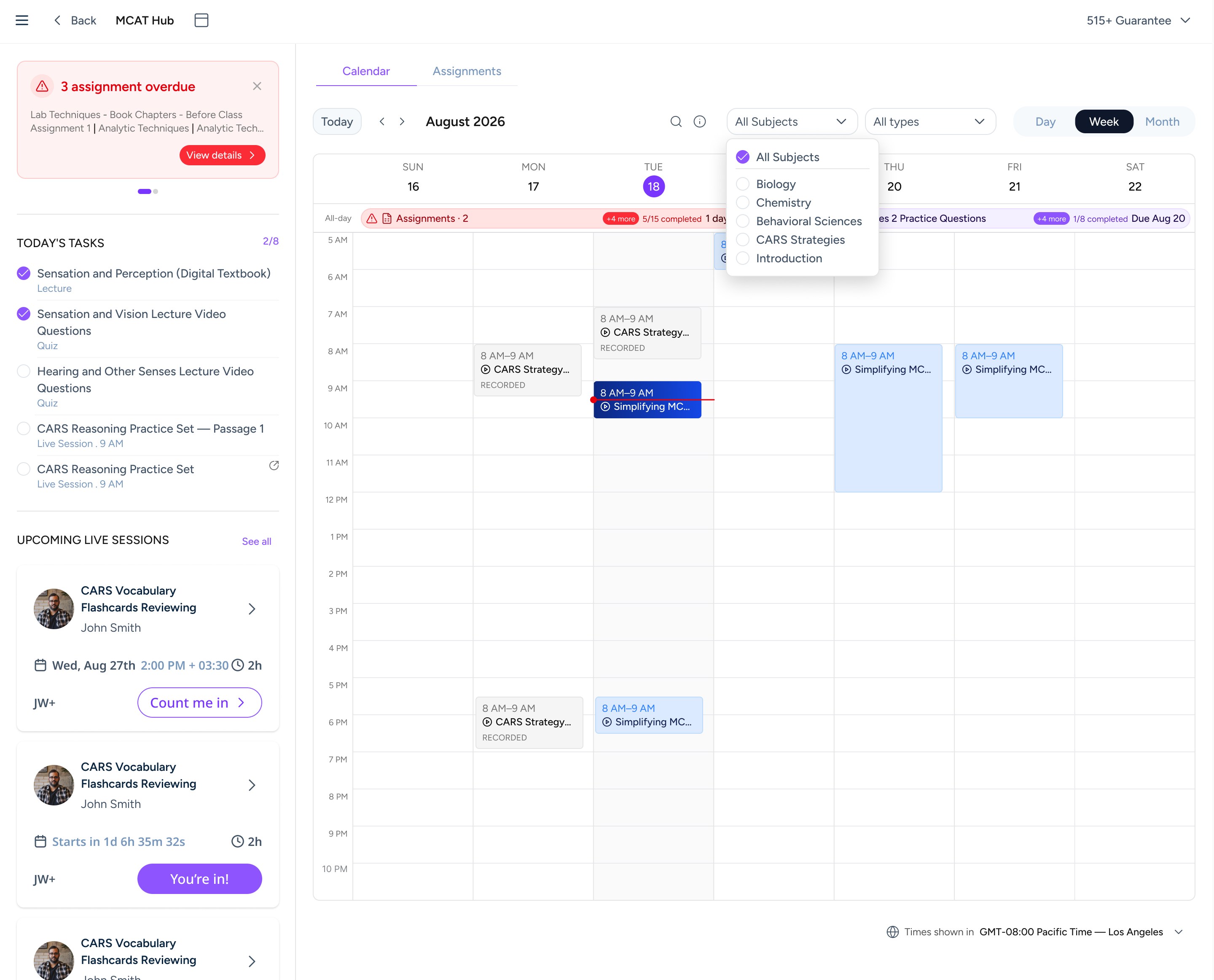
See the bigger picture
The Week view, with Today’s Tasks and upcoming live sessions beside the grid.
{{sp.n}}
{{sp.n}}{{sp.title}} {{sp.body}}
02
Know what to do next
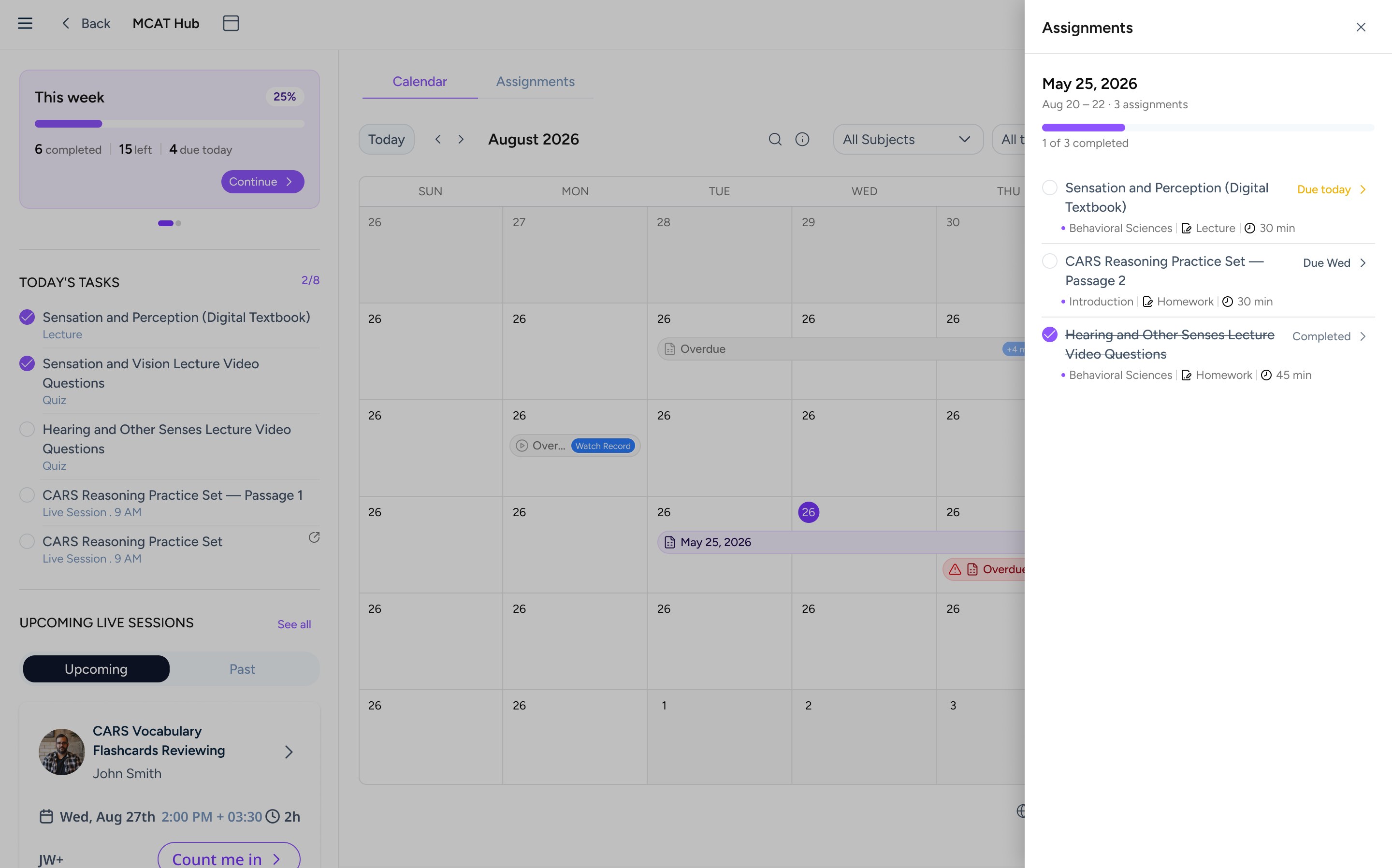
Clicking a day opens its assignments in a panel. Ticking one off updates the alert, the list and the week’s progress together.
Day Panel · a day’s work with progress
03
Stay connected to learning
A calendar only helps if students find it. Instead of one new destination, I designed several ways in, starting from the pages students already use.
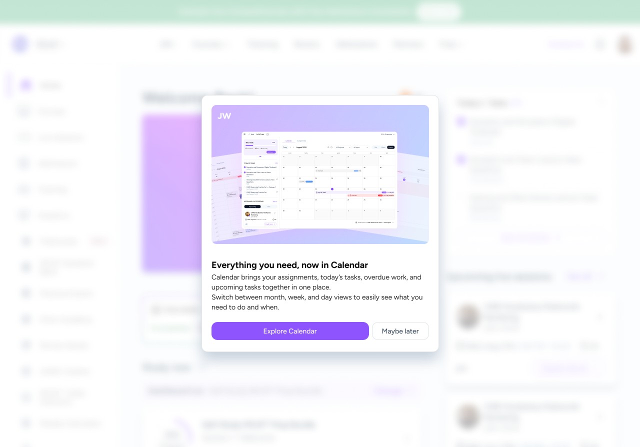
1 · First visit · a one-time pop-up on the dashboard, “Explore Calendar”
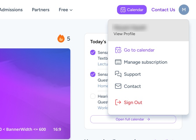
2 · Top bar · a Calendar button, plus “Go to calendar” in the profile menu
3 · Course dashboard · “View Calendar” on the This week card, “Open full calendar” under today’s tasks
4 · Learn page · a status strip with “View in Calendar”
The pop-up appears only the first time a student meets the Calendar on the dashboard, and not again after Explore Calendar. Today’s tasks and the This week card join the dashboard once they’ve explored it, on every screen size.
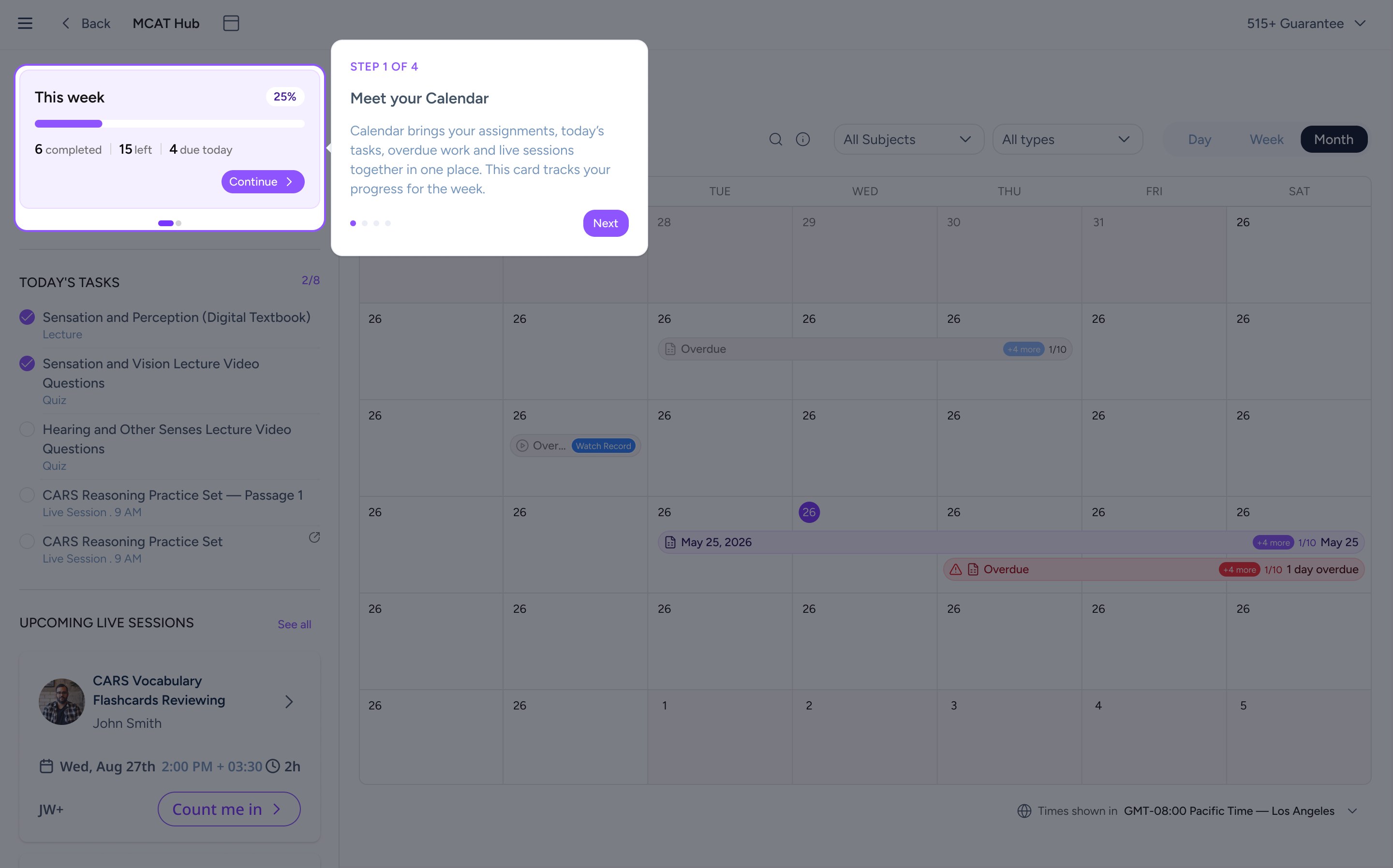
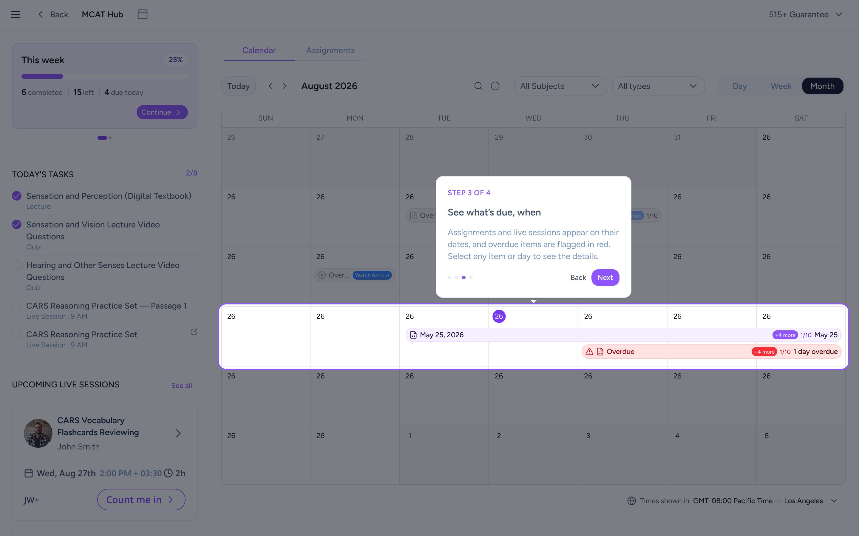
A short tour on the first visit
After students choose Explore Calendar, a four-step tour highlights one part of the page at a time, from the This week card to the calendar grid and Today’s tasks. It runs once and doesn’t appear again.
Step 1 · Meet your Calendar
Step 3 · See what’s due, when
04
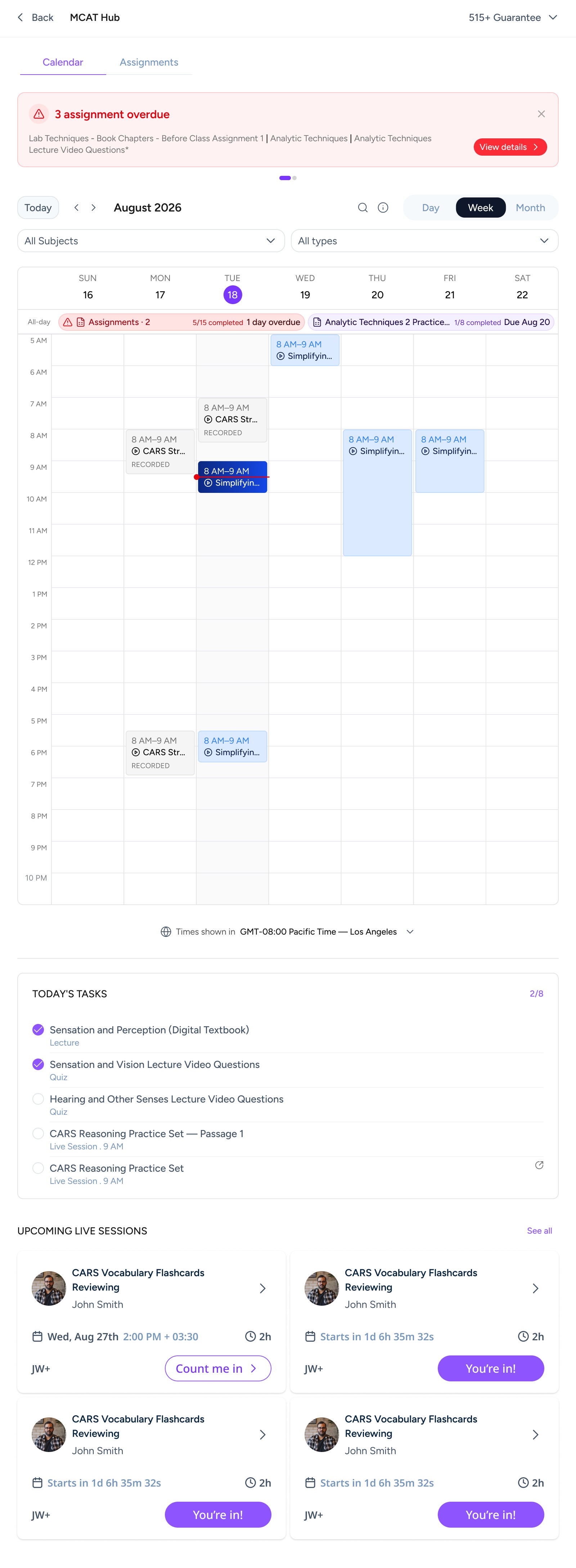
Designed for every screen
Students check their schedule on laptops, tablets and phones. The content stays the same; the layout reorders at each size. On desktop (shown above), Today’s tasks and live sessions sit in a sidebar.
Tablet · alert on top, tasks and sessions below
Mobile · one column, full-width view switcher
05 · Delivery, evaluation & reflection
What I delivered and how I’d evaluate it.
I designed the Calendar’s Month, Week and Day views, the Assignments view and Day Panel, the overdue states, the entry points from the course dashboard and Learn page, the first-visit introduction, and layouts for desktop, tablet and mobile, working with the PM and front-end engineer, who built it.
The Calendar has launched for Live course students. Its impact hasn’t been evaluated yet, and the screens here are from my final designs, so details of the live product may differ.
How I’d evaluate it
Proposed measures to evaluate the experience, not results.
Calendar adoptionAre Live students actually using the Calendar?
On-time completionAre more assignments finished before their deadline?
Reduction in overdue workDoes the average number of overdue assignments drop?
Live-session engagementDo students join, and recover missed classes through recordings?
What I learnedPrioritization is part of the design. Working within real product constraints meant deciding what V1 should leave out, and keeping the first release focused on the information students already depended on: what’s due, what’s late and what’s next.