It’s not your fault.
Redesigning the onboarding of Lila, an AI nutrition app for women in perimenopause, around one question: how do you earn someone’s trust before asking them to commit?
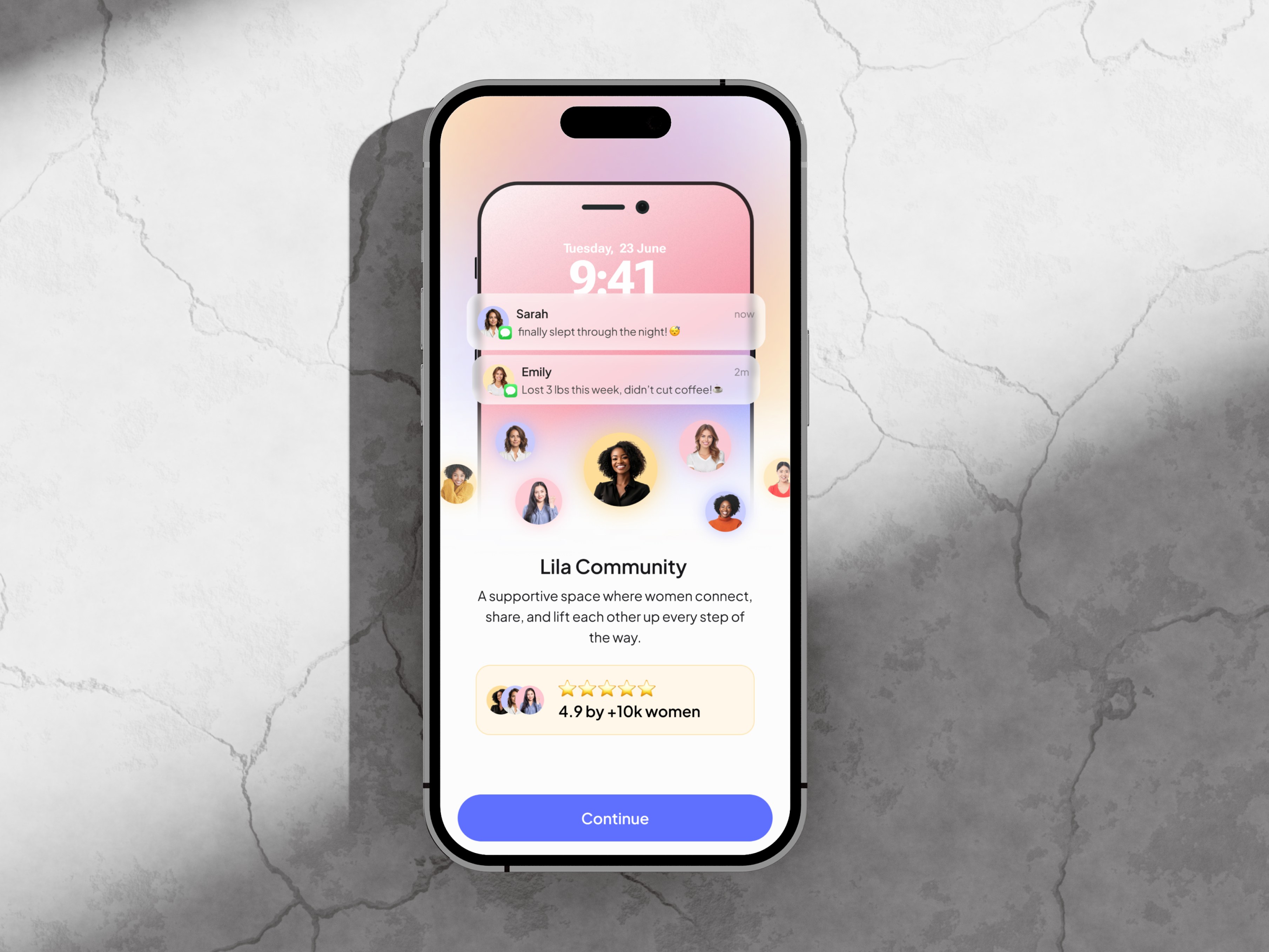
Lila, an AI nutrition app for women in perimenopause.
Product Designer. Led the end-to-end onboarding redesign, from UX audit and competitive research to user journey mapping, three rounds of wireframes, usability testing, final UI and design system. Collaborated with Lila’s team on implementation and handoff.
Audit → research → V1 → testing with six women → V2 → business review → final flow → UI and design system.
Final wireframes (30 screens), final UI (35 screens), illustration direction, design system and a measurement plan.
01 · Context
Why onboarding mattered so much.
Lila helps women in perimenopause manage their weight with personalised nutrition plans. In a product like this, onboarding carries two jobs at once: it has to show why Lila is worth her time, and it has to collect the information needed to build her plan. If either job fails, she leaves before the product can help her.
The challenge was to balance both without making a long flow feel longer.
02 · What I found first
I started with an audit, not a redesign.
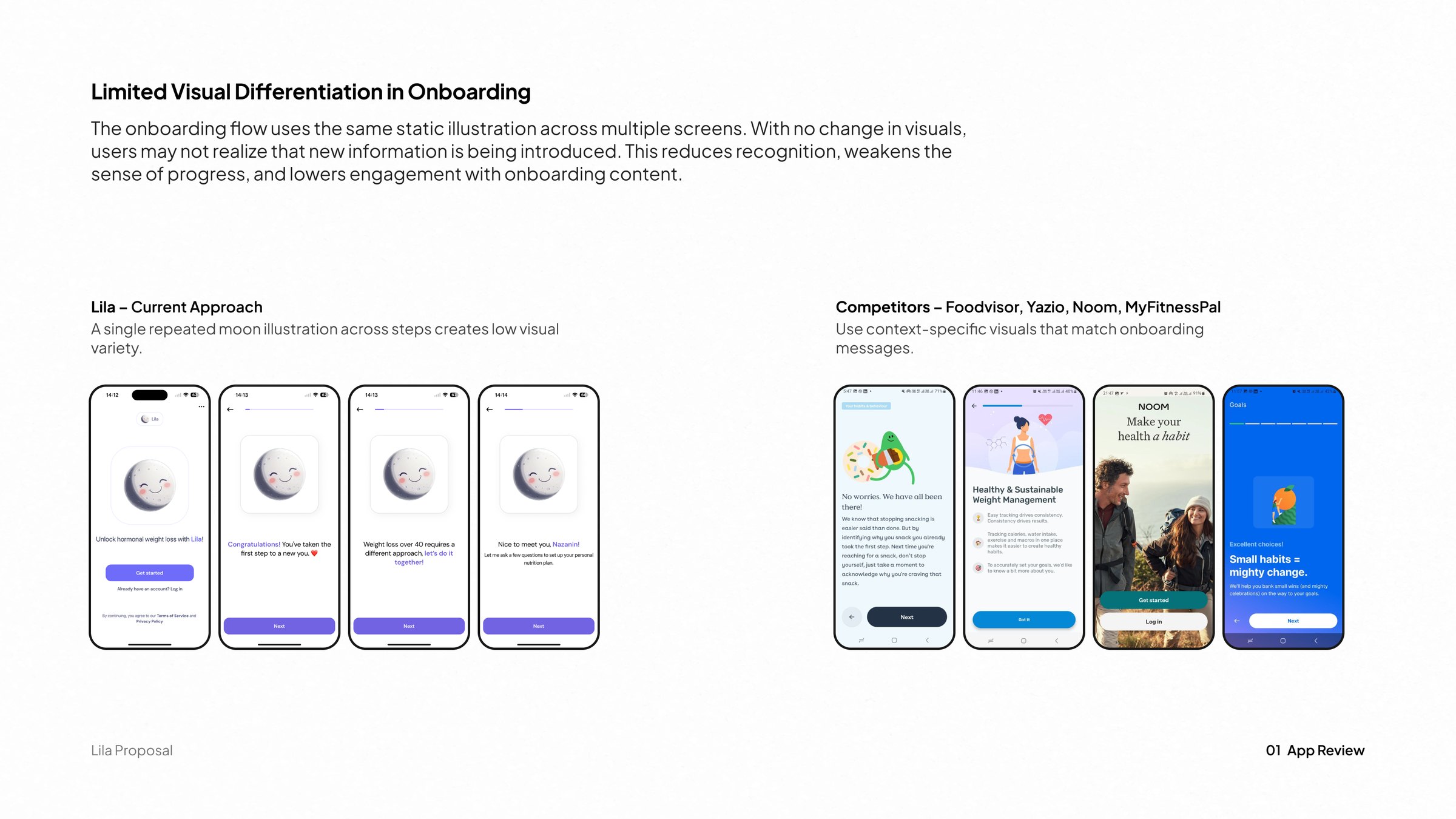
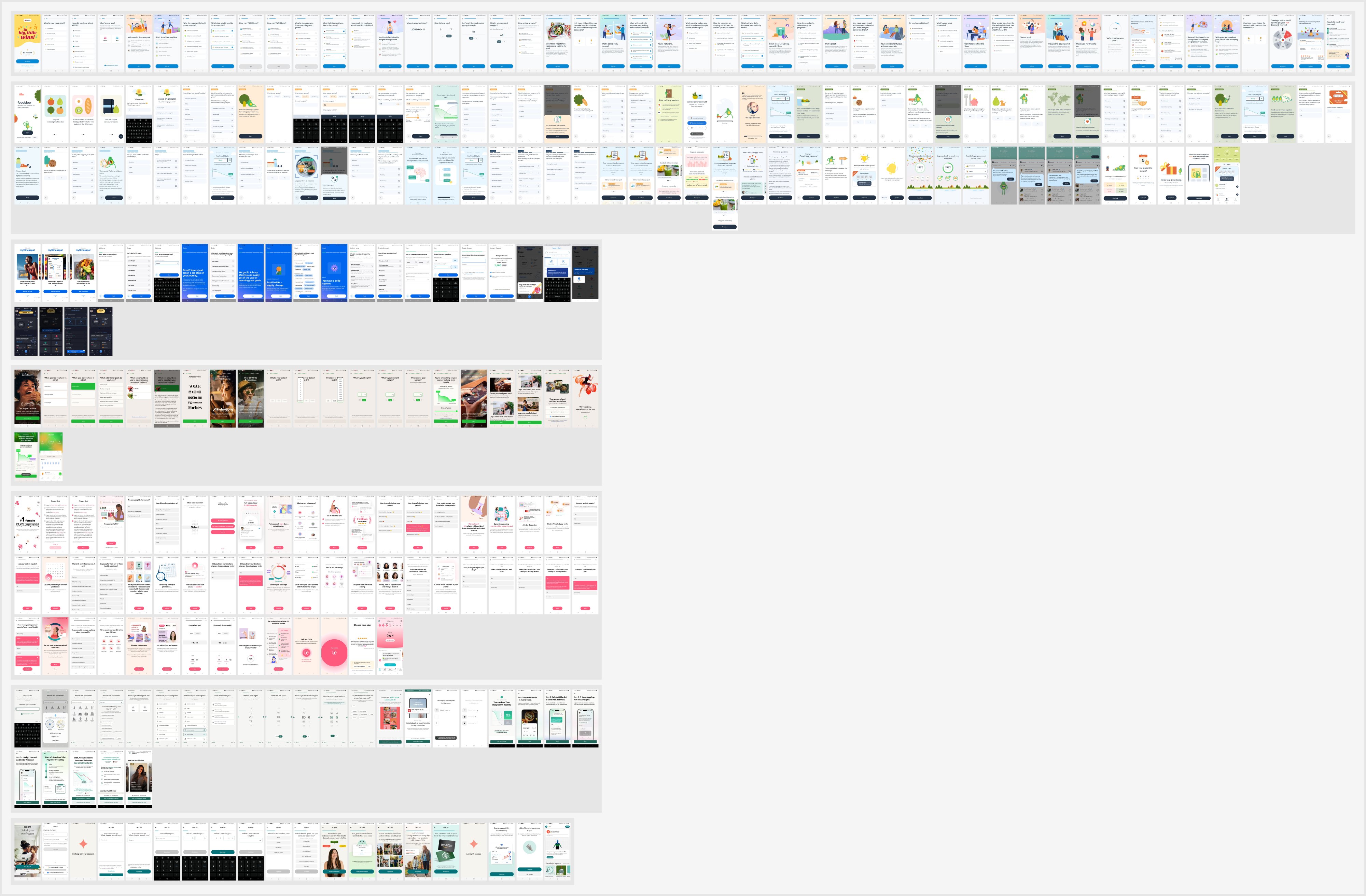
I reviewed the existing 42-screen onboarding with a heuristic evaluation and an initial competitor review. Several problems were foundational and visible without further research. I documented them and turned them into a proposal for Lila’s team.
Five of the original 42 screens.
03 · Understanding the audience and the market
Who she is, and what she has already tried.
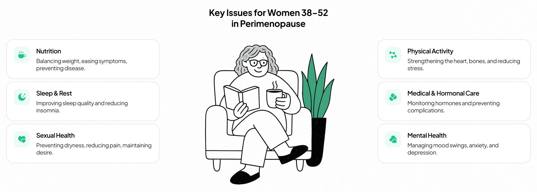
I looked at the lifestyle and challenges of women in perimenopause, why they would choose an app like Lila, and what would make them trust it or leave.
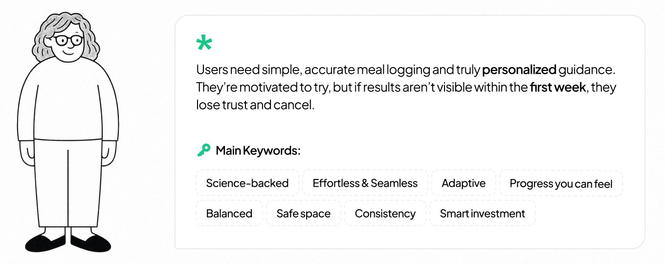
Key insightShe doesn’t believe weight loss is possible anymore. The job isn’t to promise it. It’s to explain why everything else failed.
In each app I looked at how it builds trust, asks for personal data, sets its tone and keeps a long flow engaging. I also studied onboarding patterns such as guided task completion and progressive onboarding. In PostHog replays of Lila’s original flow, I watched how people actually moved through it.
The strongest flows reassure people between questions instead of asking one after another.
People paused longest on question screens and scanned every option, even on simple questions.
Many left after the planning step, before giving an email.
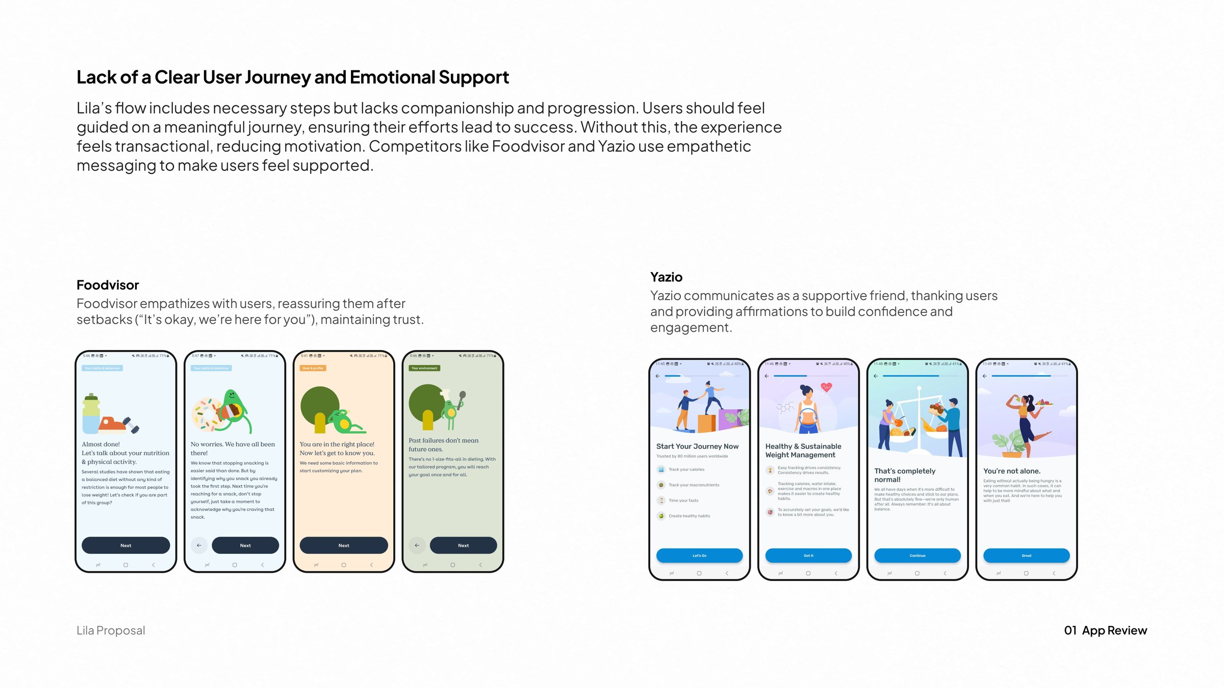
What benchmarking gave me
14 of 21 ideas made it into the final flow.
Only Lila and Caria are built around menopause.
Lila’s coaching is AI only, and it has no community.
At $20 a month, Lila costs the most of the five.
Earn her trust
- Use numbers and proofRating card
- Trust and data security“Your privacy matters” screen
- Explain every requestReminders: why before asking
- Reassure on sensitive questions“Your choices won’t limit Lila’s features”
Make it about her
- Personalised framingMain goal asked first
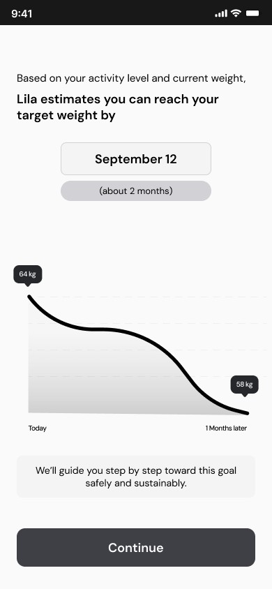
- Feedback on goal weightGoal date and a realistic curve
- Visualise the first monthToday, 15 days, 30 days
- Before vs afterOld diets vs Lila
- Identity and belonging“You’re not alone” and the Lila Community
Keep it light
- Friendly, conversational toneShort questions in Lila’s voice
- Time-based promise“Just a few quick questions”
- Picture-based questionsEmoji options instead of plain lists
- Agree/disagree statements“Do you relate to the statement?”
- One feature-highlight slide“A plan made for your body”
04 · Designing the first journey
A journey with four jobs, and a question list to agree on.
- 01Build trustwith a woman who has been let down before.
- 02Ask the questionsher plan needs.
- 03Introduce the featuresthat make Lila different.
- 04Lead her to her accountand her first meal log.
Sorting the question list.
Lila’s team gave me the questions the plan depends on. I had to decide what to keep, what to make optional and in which order.
Necessary
20
Required by the business to build a safe, personal plan.
See all 20
- Source (e.g. via Google)
- Main goal (e.g. lose weight, more energy)
- Age
- Imperial or metric
- Height
- Weight
- Target weight
- Target weight date
- Activity level
- Diet preference (e.g. vegetarian)
- Food allergies or restrictions
- Menopause stage
- Most frequent symptoms, physical and mental
- Which symptom to address first
- Commitment level: how fast to see results
- Leave a review
- Name, for a personal feel
- A demo of an “aha” moment in the app
- What she tried before (e.g. MyFitnessPal)
- Biggest struggle with food
Optional
14
Useful extras the plan doesn’t depend on.
See all 14
- Diet habits (e.g. frequent snacking)
- Meals per day
- Does she track calories or macros?
- How often she cooks at home
- Daily water intake
- Hours of sleep per night
- Health conditions (e.g. diabetes)
- Motivation to change right now (1–10)
- Daily reminders and encouragement
- Strict plan or flexible guidance
- Preferred coaching style
- Daily time to spend in the app
- Supplements
- Agree/disagree statements (e.g. “I tried many apps”)
What we agreed
- Keep every necessary question.They set her calorie targets, meal plan, coaching style and goal date.
- Ask in short blocks.Something useful between each block.
- Low-value questions go last.
The first user flow.
I mapped the flow as a rhythm: a block of questions, then a moment that gives something back, so trust is built between the asks rather than before them.
- Starts her journey
- Trust · empathy
- Questions · part 1
- Trust · success story
- Questions · part 2
- Trust · success indicators
- Questions · part 3
- Features · AI
- Trust · empathy
- Questions · part 4
- Loading her plan
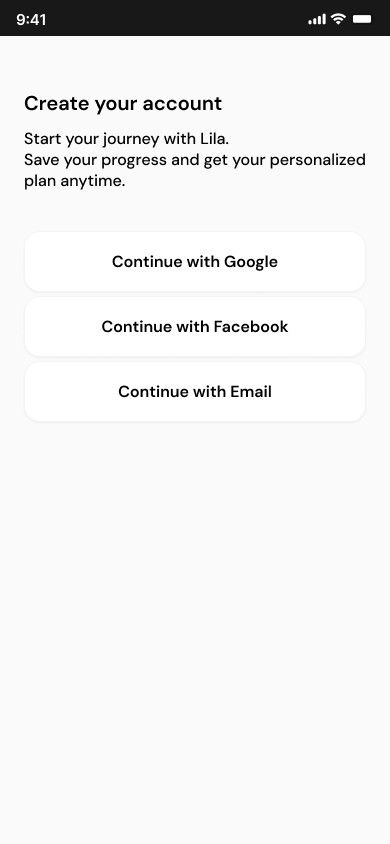
- Create account
- Motivation
- Active plan

05 · Wireframe V1
Everything the journey asked for.
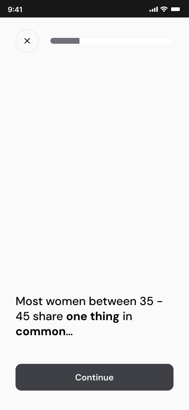
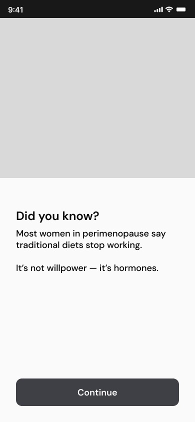
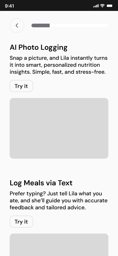
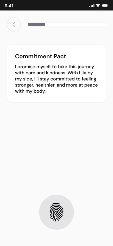
49screensV1 kept everything we believed could work: what the business needed, the patterns from the apps I benchmarked, and what we had learned about her needs. It explained before it asked, added trust moments between question blocks, let her try key features and closed with a commitment step.
Lila’s team believed every screen was needed. I wasn’t sure a 49‑screen flow would hold her attention, but instead of arguing, I agreed and asked to test it with real users. Usability testing would show which screens earned their place.
06 · Usability testing
Six women, and the turning point.
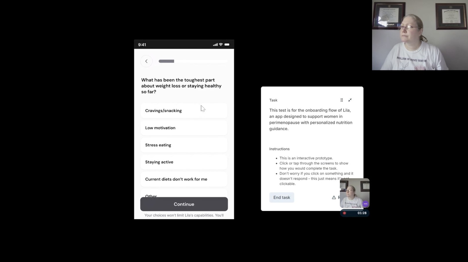
I tested V1 as a clickable prototype in remote, recorded sessions with six women. The same patterns appeared across sessions.
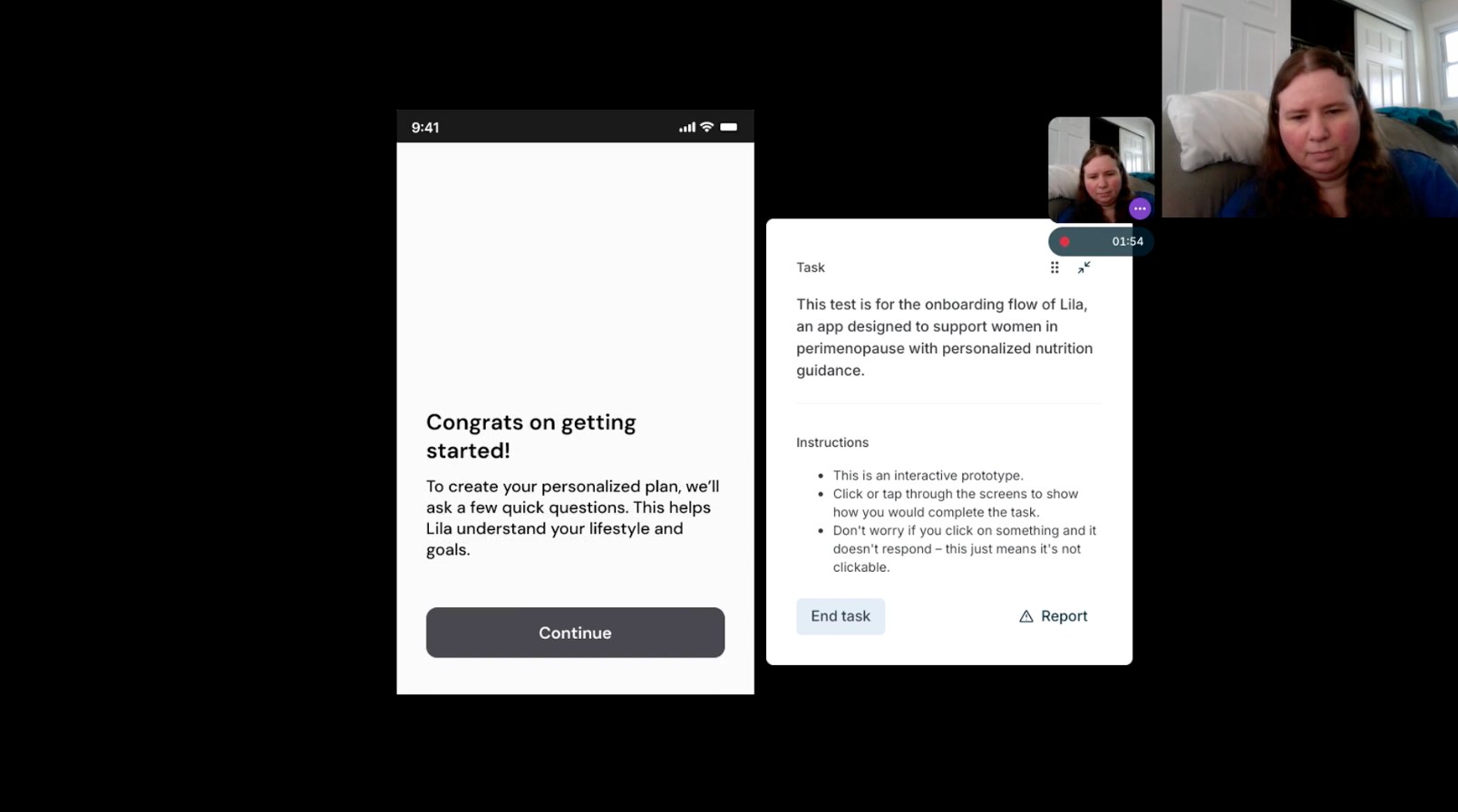
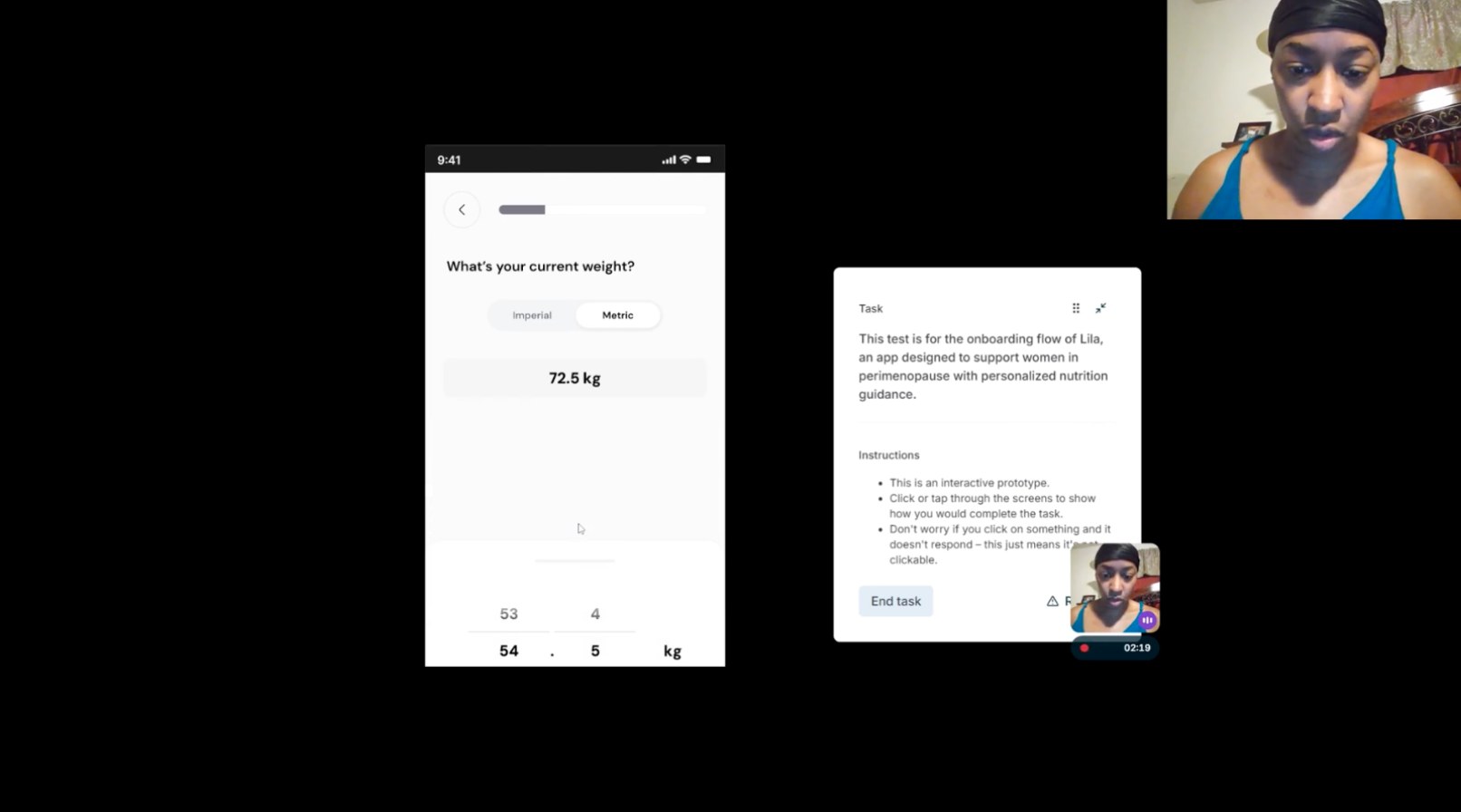
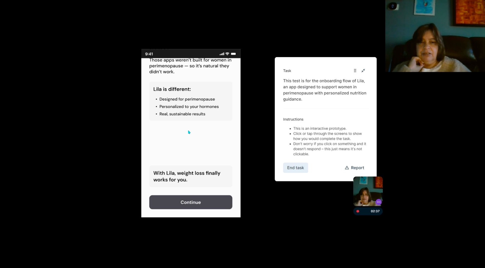
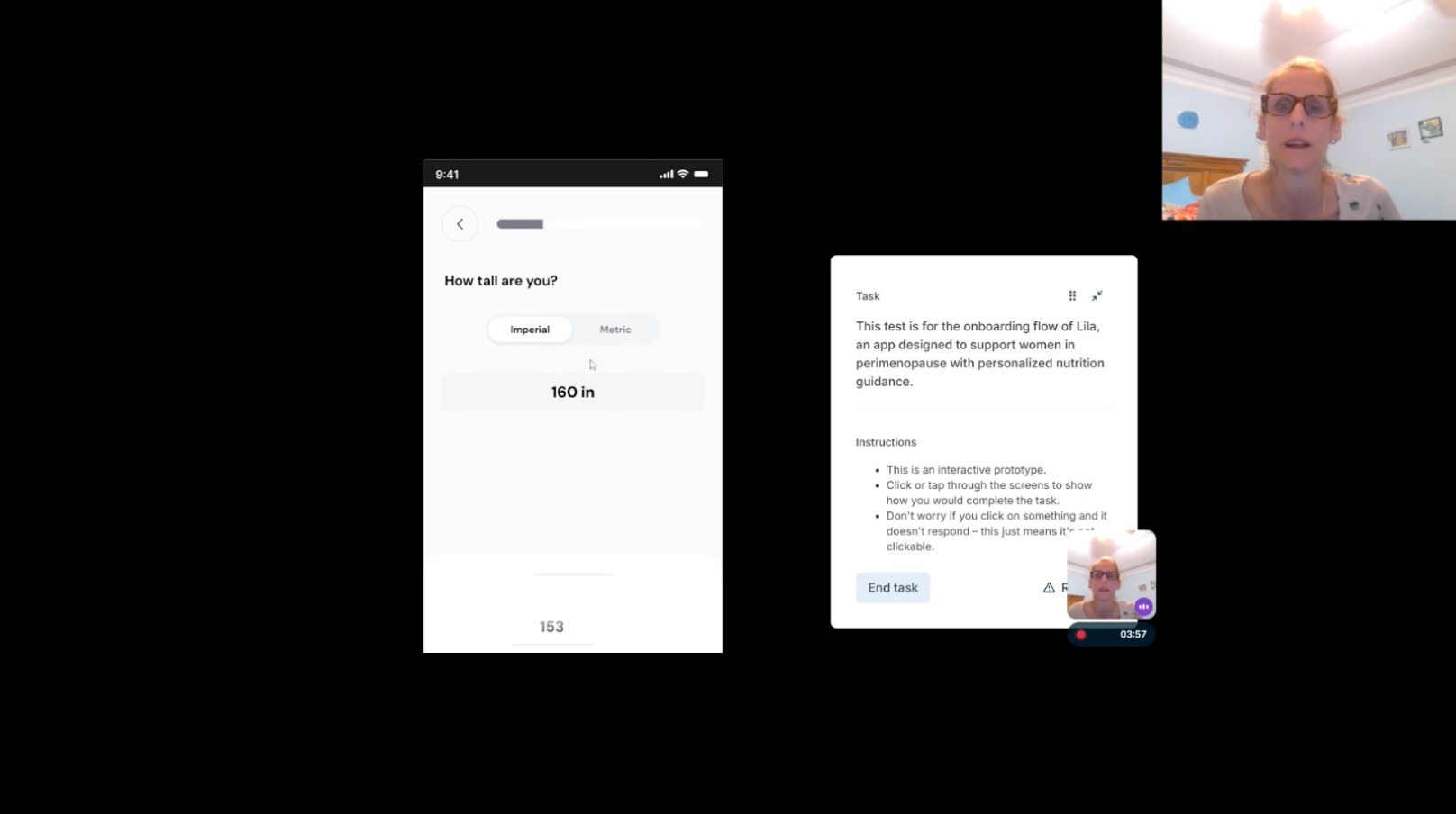
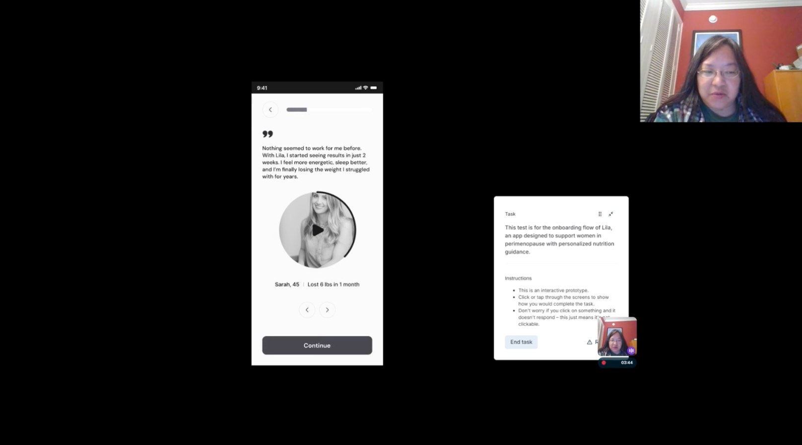
Observations from six recorded sessions, not measured rates.
07 · Wireframe V2
A much shorter proposal.
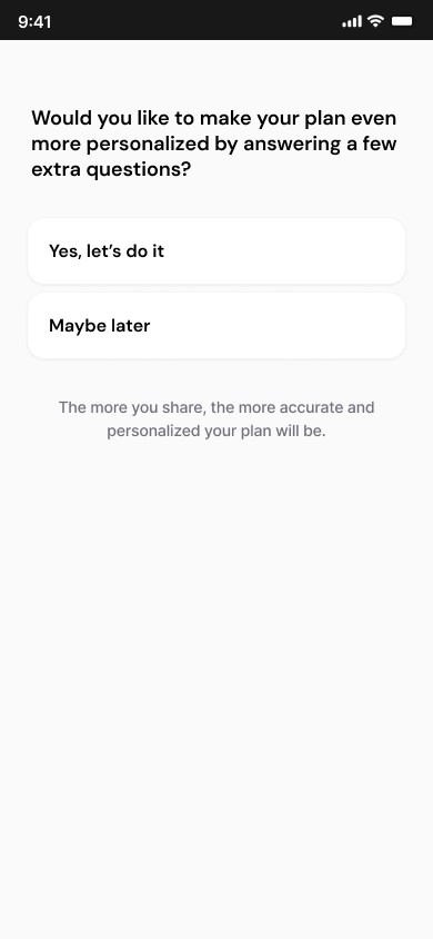
19screensAfter testing, I proposed cutting the flow by more than half. The original onboarding already had a low completion rate, and testers skipped long explanatory slides and often just pressed Next. So I removed the screens full of explanation and kept only what mattered:
Cut
Explanation slidesScreens full of text that testers skipped or didn’t read.Kept · my first goal
Everything the plan depends onEvery question the team needs to prepare her personal plan.Kept · from testing
Screens that built trustTestimonials and photos of other women like her, which helped testers trust Lila.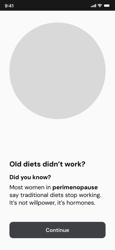
08 · Business constraints and the final version
The shortest flow wasn’t the most viable one.
I reviewed V2 with Lila’s business and technical teams, and it wasn’t fully approved. Some questions were essential for personalisation, and some content had to stay for business reasons. Rather than defend the shortest version, I treated those requirements as real constraints and redesigned around them.
Less to read, faster to value, no repeated taps
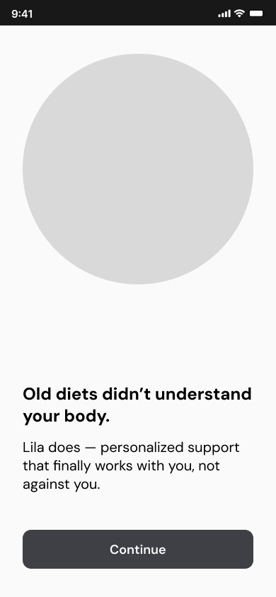
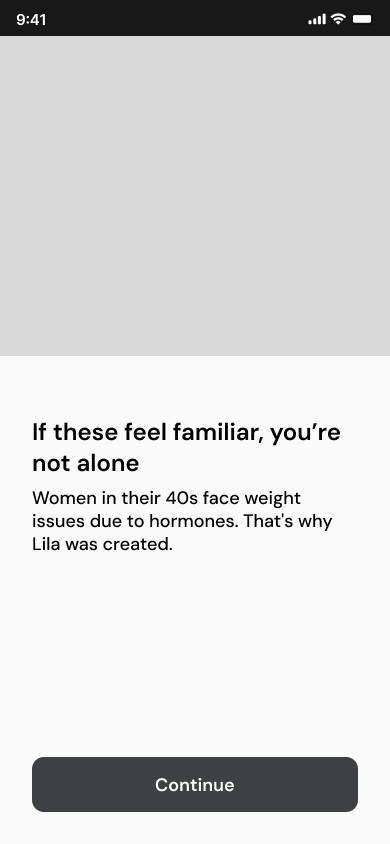
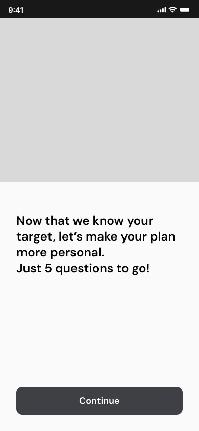
Final approved wireframes
Every question required for a safe, personal plan
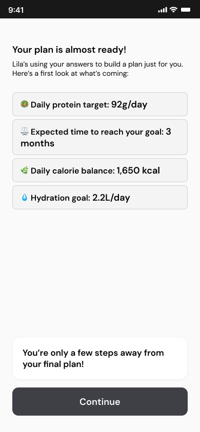
The final flow kept the required questions but grouped them into short blocks, placed trust moments between them, moved low-value questions to the end and showed her plan before the account. It is shorter and clearer than the original, and it still gives the business what it needs.
09 · Illustration exploration
A visual style she would recognise as hers.
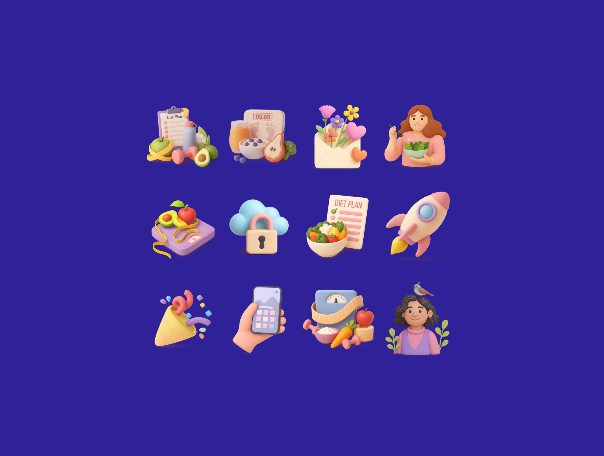
For an audience that often feels overlooked, illustration sets the emotional tone. I explored eight directions, including watercolor, flat, line art and 3D, and asked several women from the target audience which felt right. The soft, clay-like 3D direction was preferred.
Votes as recorded in my Figma file. An exploratory preference check, not a statistical test.
10 · Final UI and design system
From approved flow to final UI.
Before designing screens, I set up a shared foundation, then defined the visual language and applied both across the onboarding.
Building the foundations
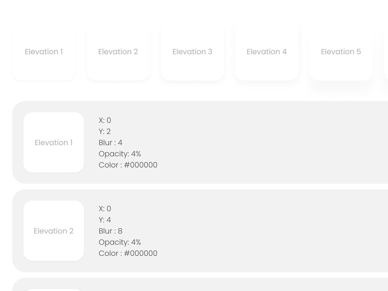
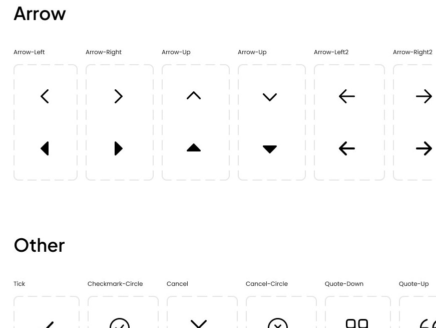
Defining the visual language
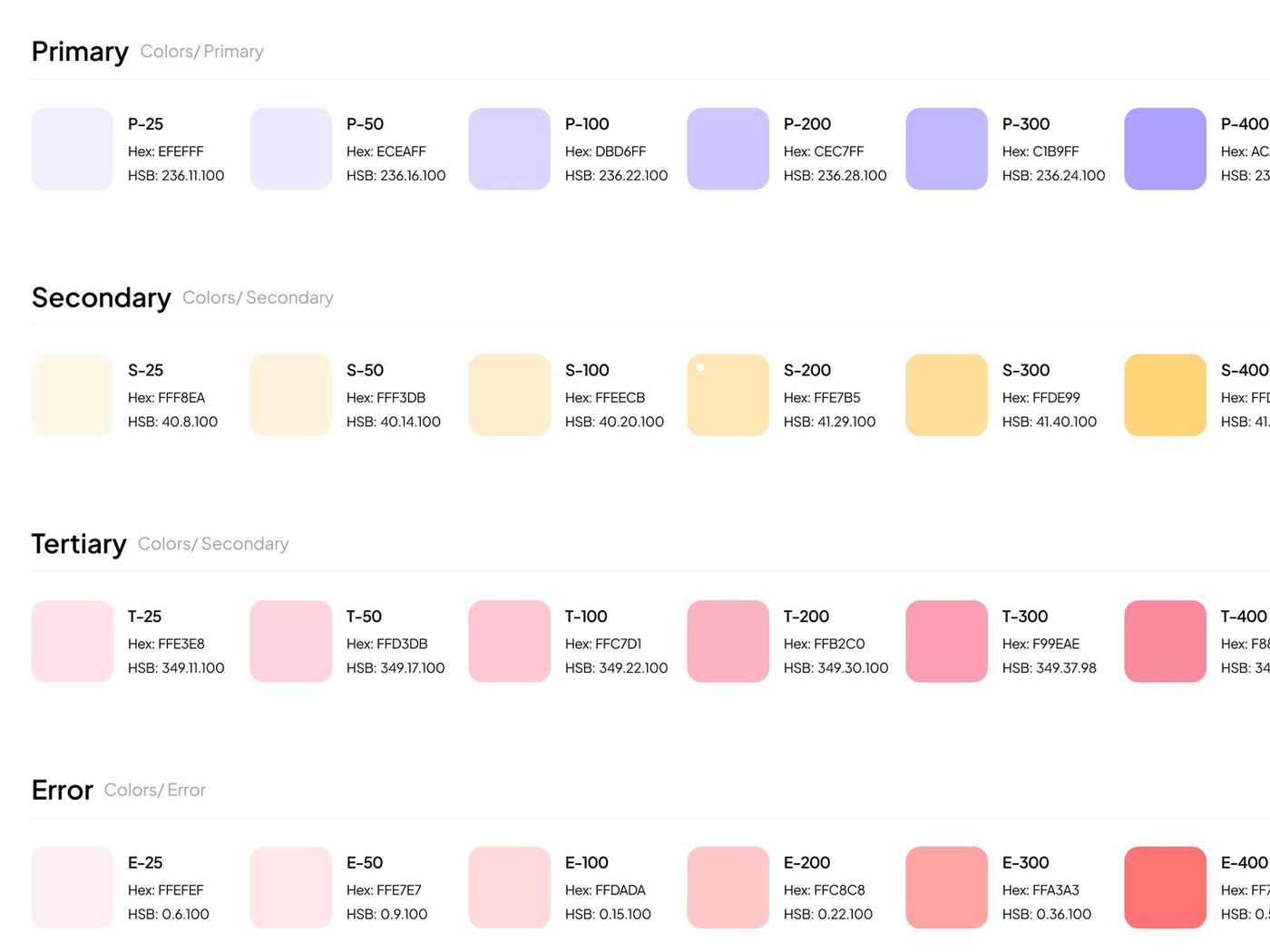
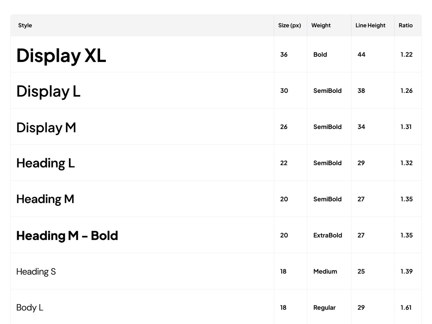
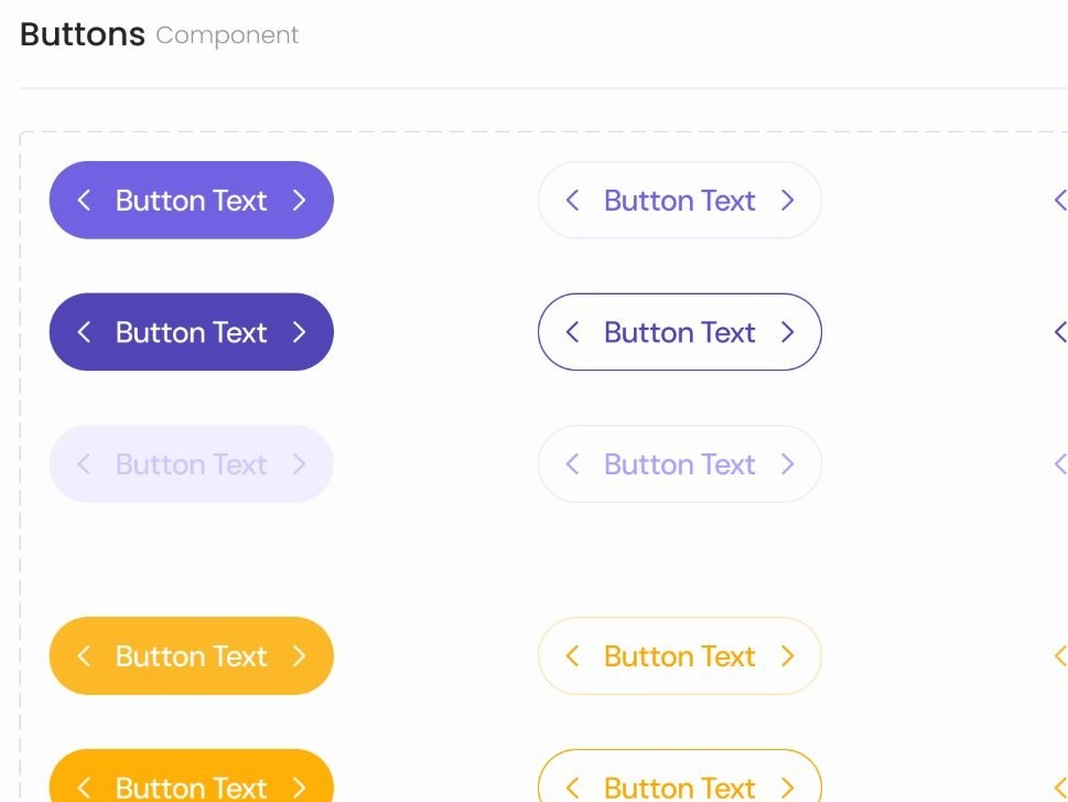
I built on Lila’s existing visual identity, creating a consistent system of colours, typography, components and illustrations that could scale across the onboarding experience.
Colour
Typography
abcdefghijklmnopqrstuvwxyz · 0123456789
Illustration set
Components & icons
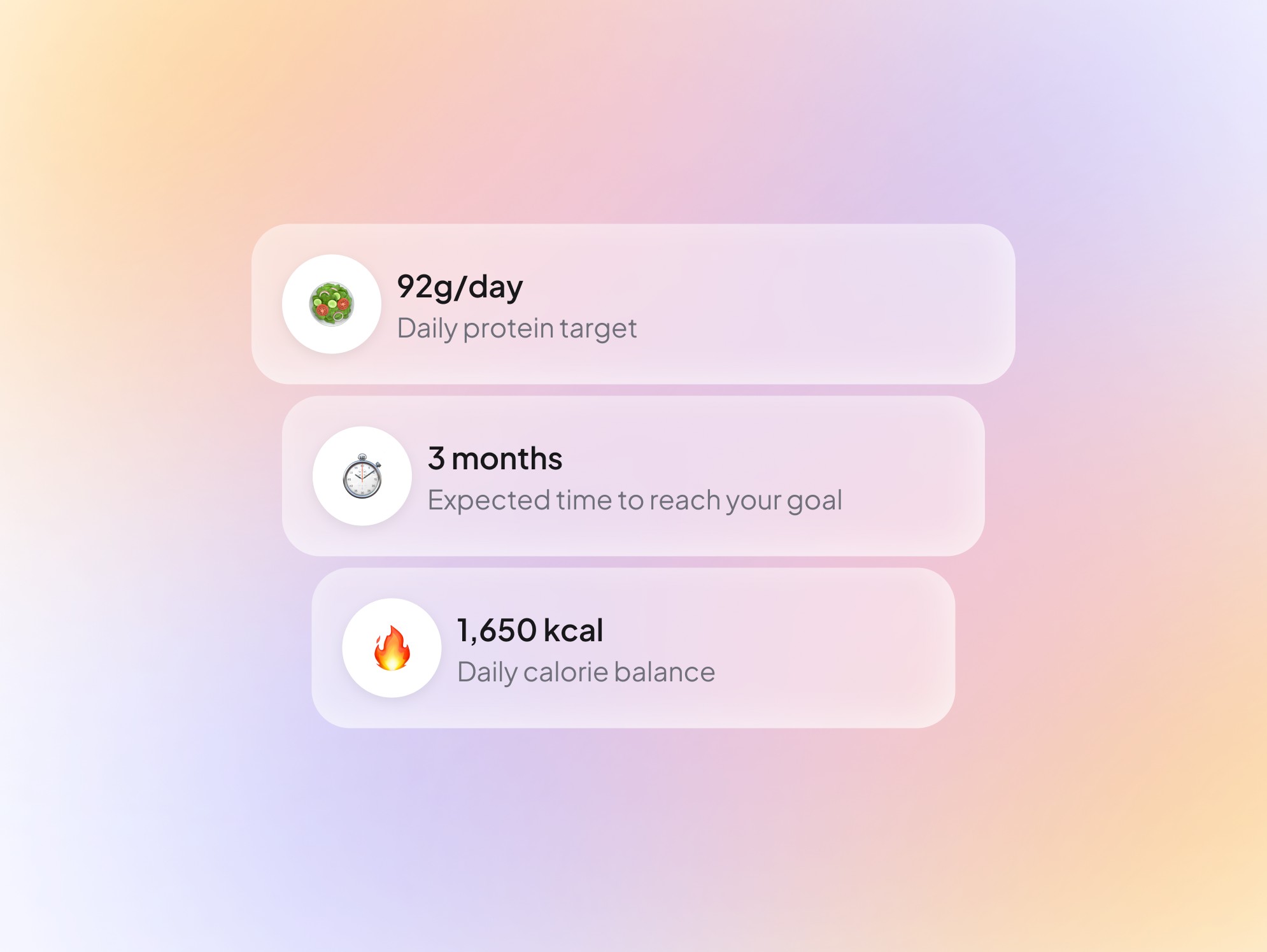
Illustration in context

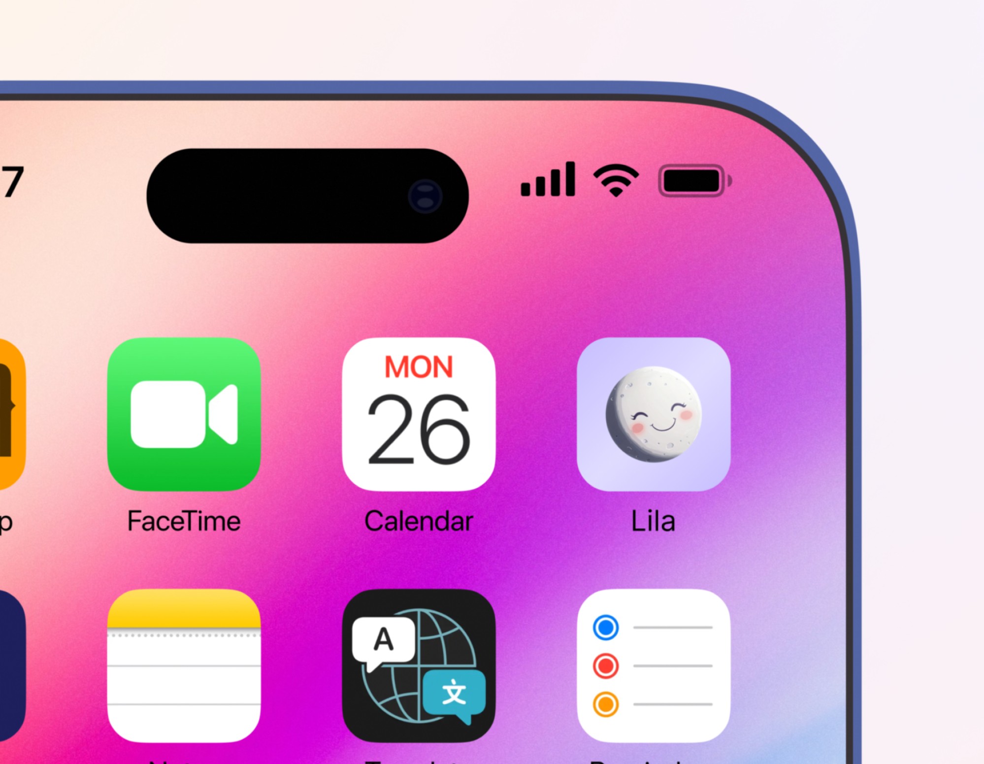
App icon
Applying the system
The foundations came together in 35 final UI screens.
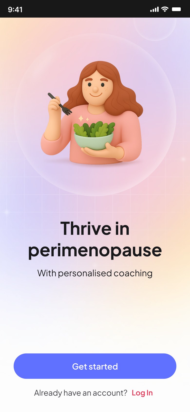
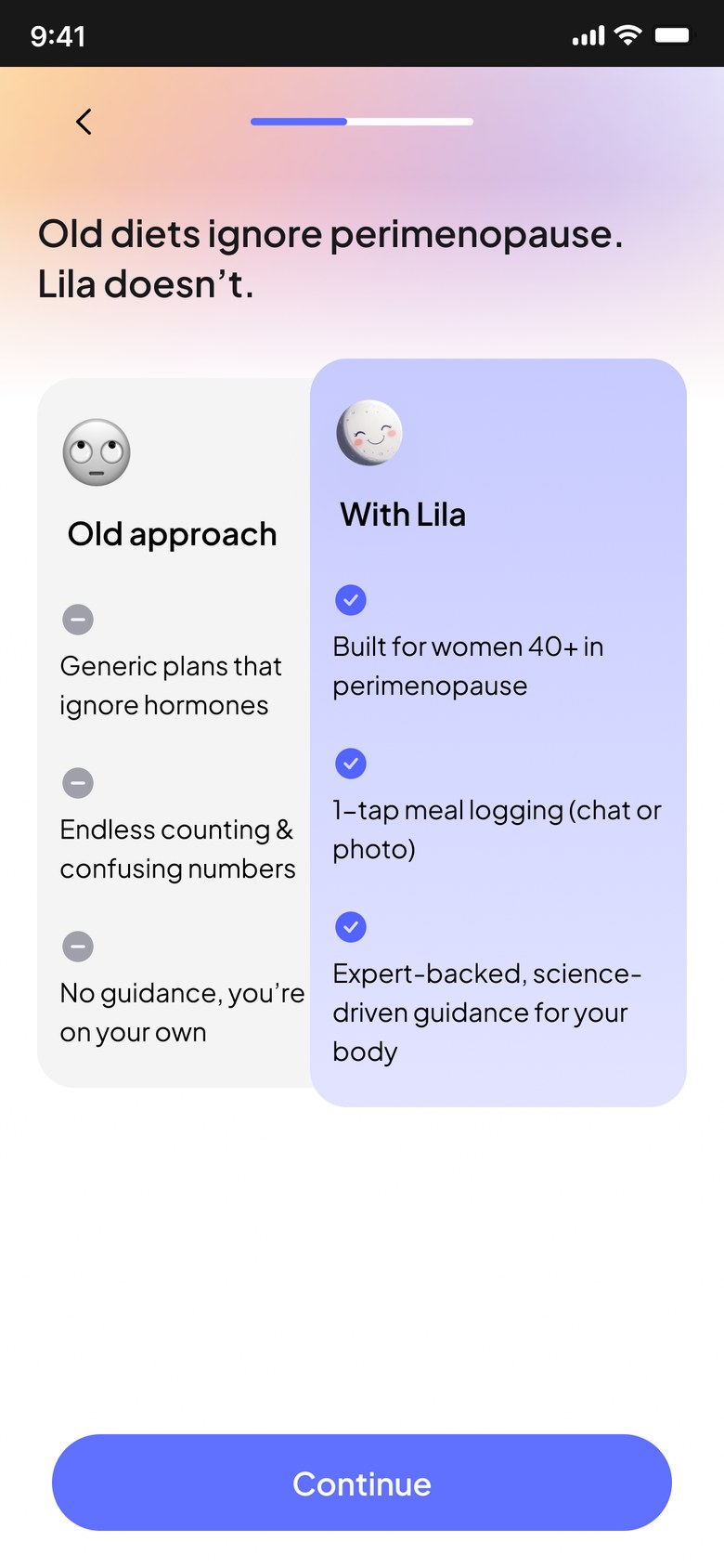
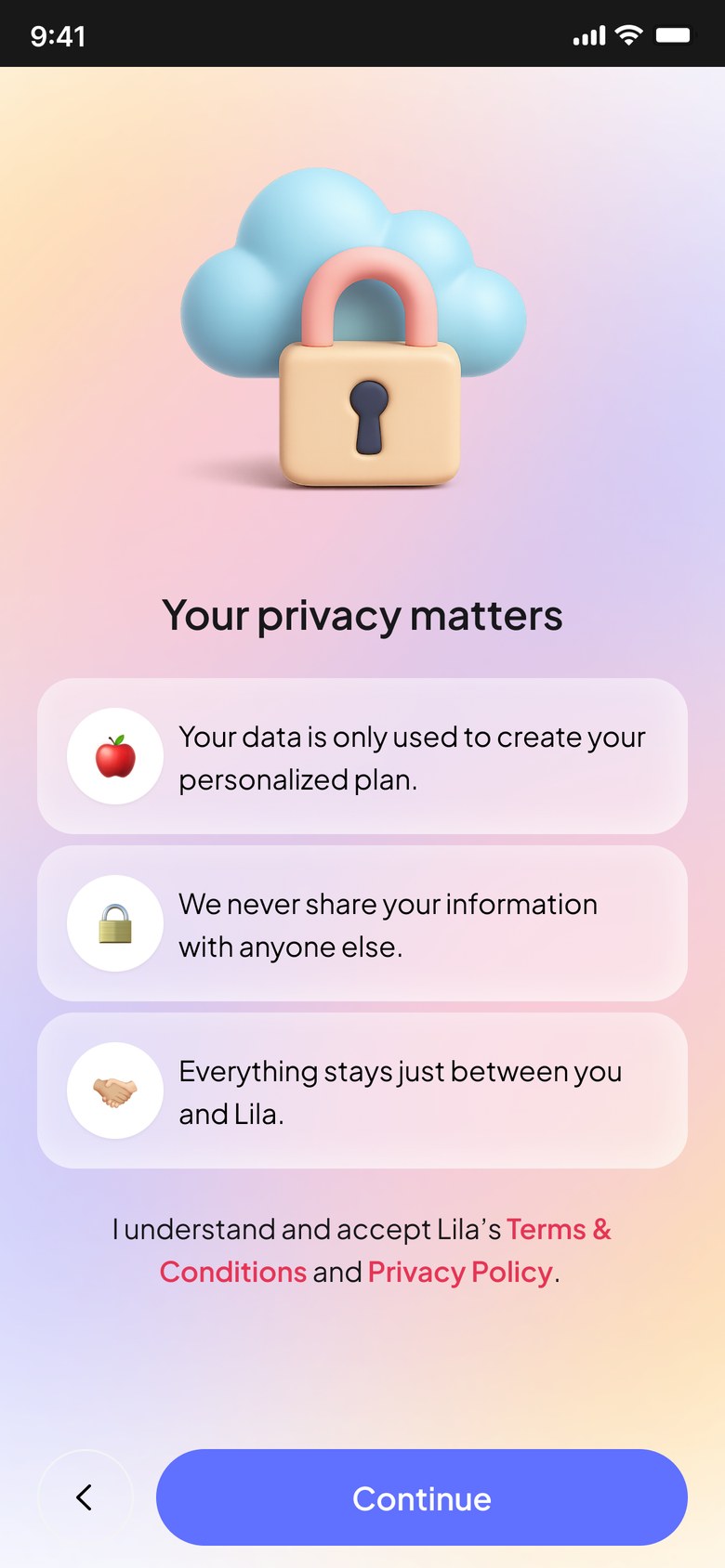
Responsive, and checked with engineers early
Layered gradients, glass bubbles and 3D illustrations become complex across screen sizes. I reviewed feasibility and responsive behaviour with Lila’s developers before the UI was final, and refined the designs around what they could build.
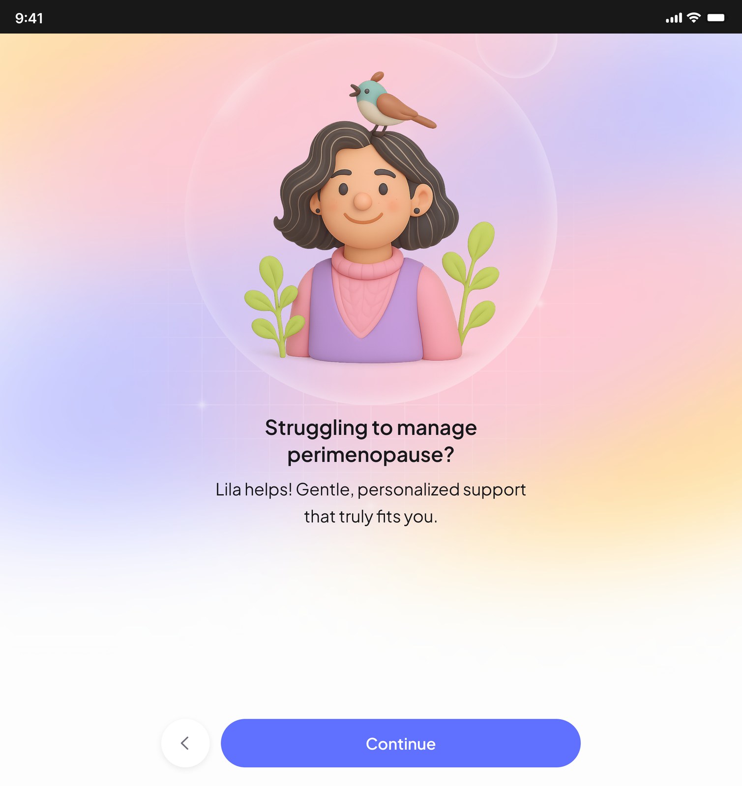
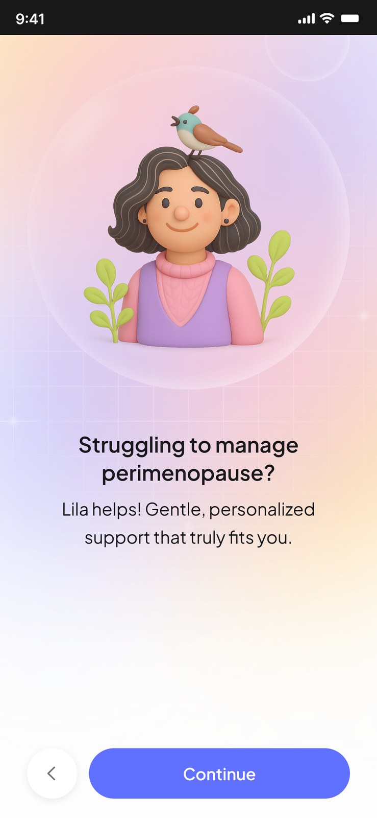
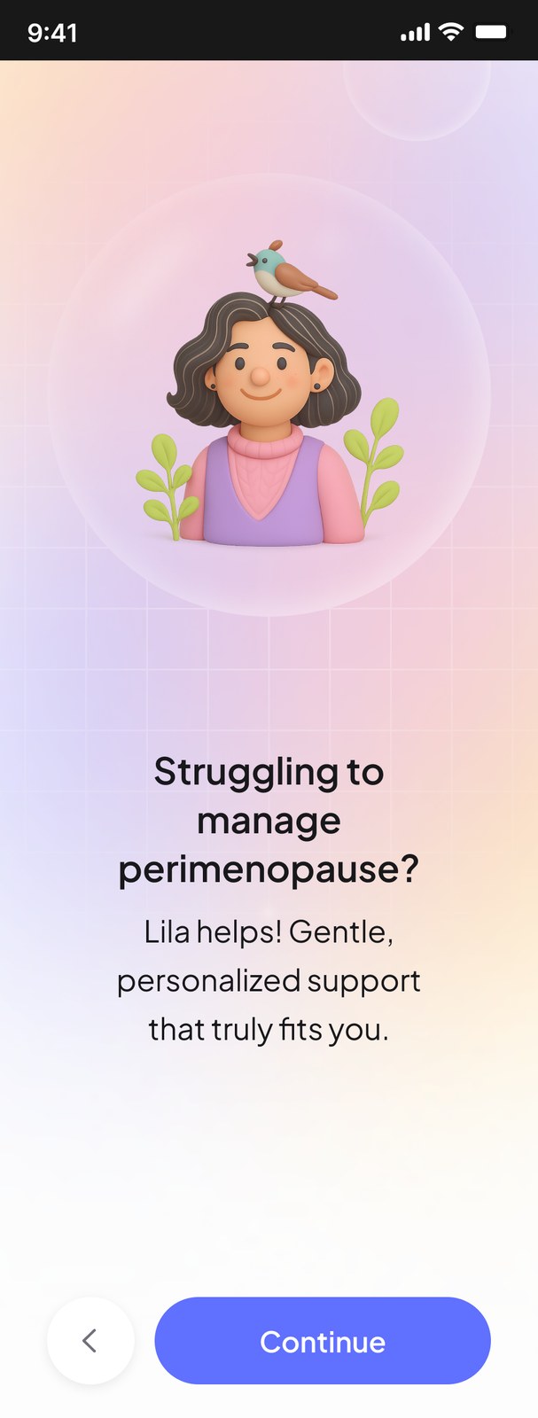
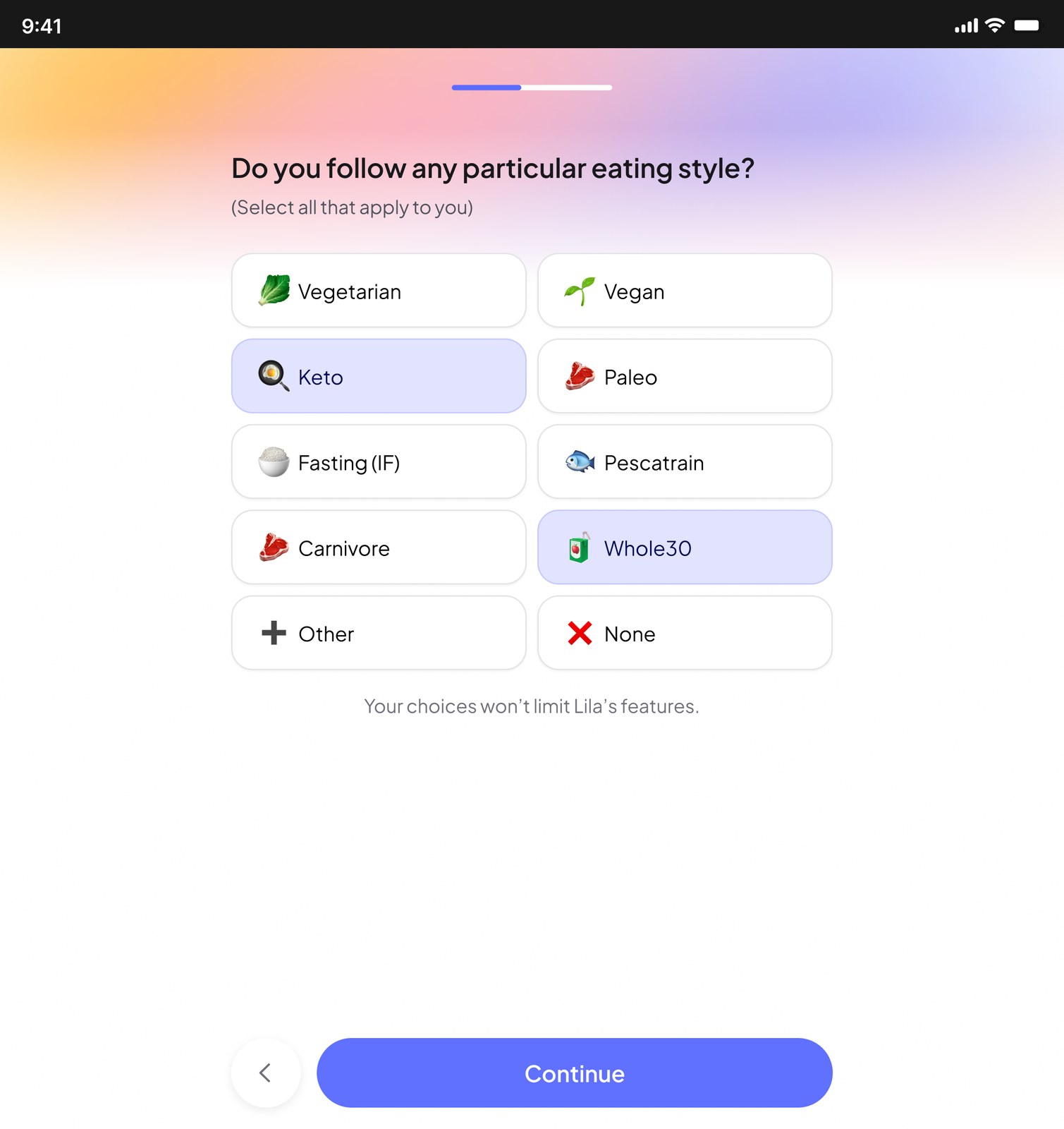
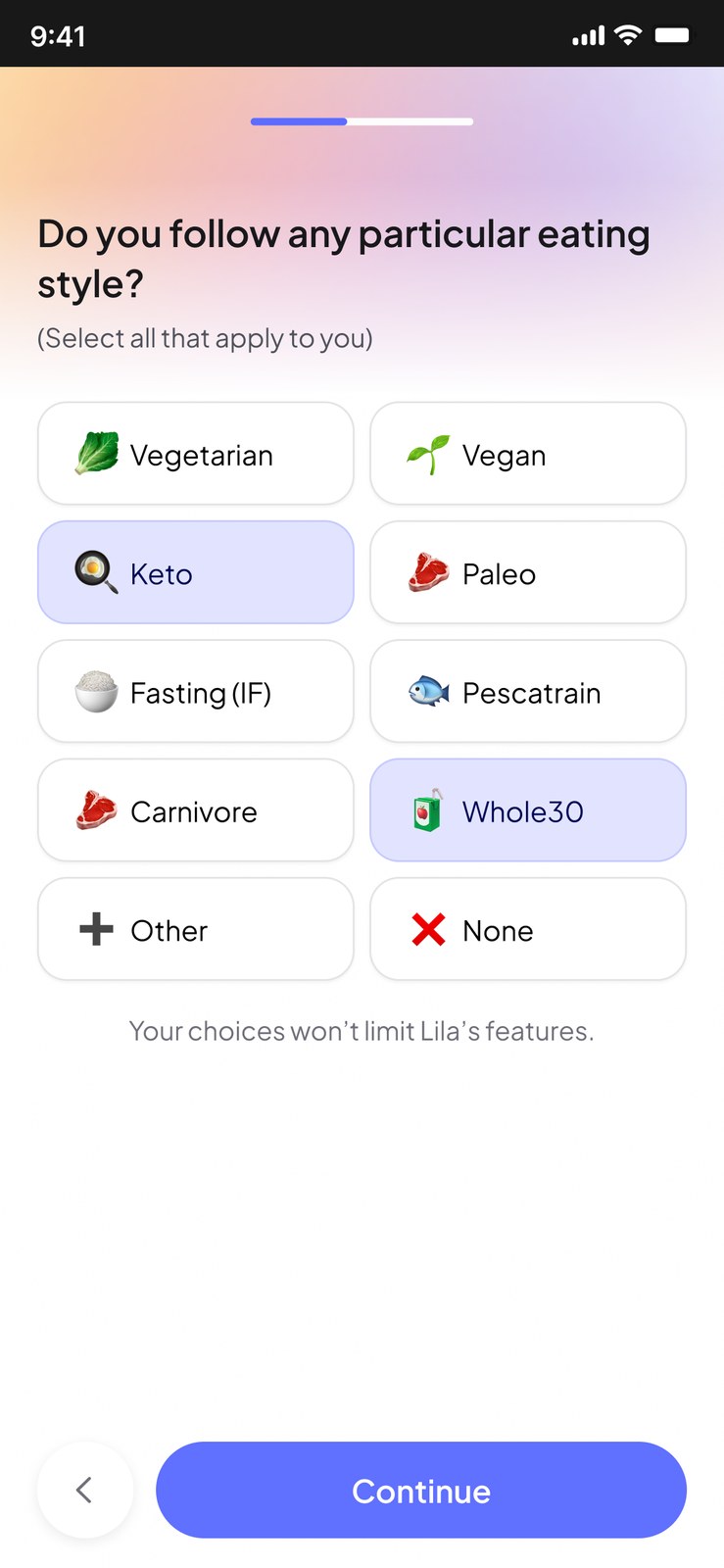
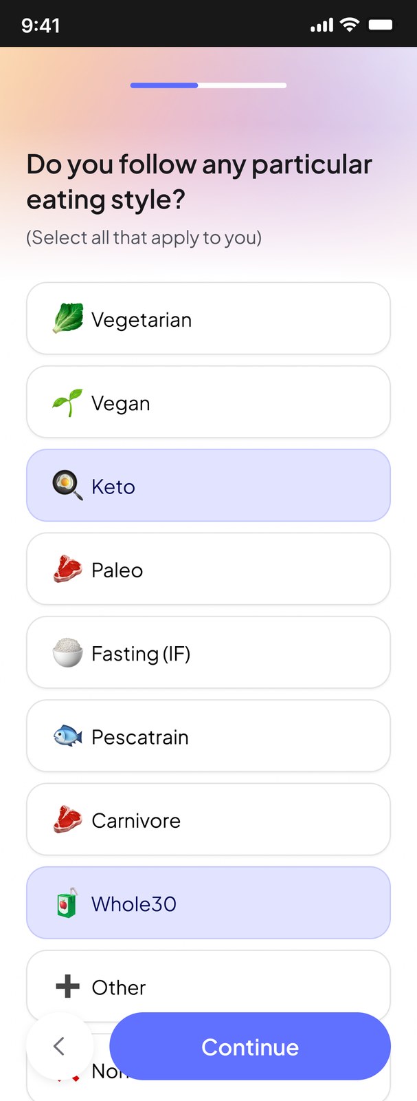
On tablet, content stays in a centred column and the background stretches. On small phones, options drop to one column and the illustration scales down.
11 · Handoff and measurement
What I delivered, and what should be measured.
I delivered the redesigned onboarding, the design system and the illustration direction, together with a recommendation for what Lila’s team should measure after implementation.
This was a project-based collaboration, so I didn’t continue long-term follow-up after handoff. I don’t have verified post-launch results.
If I were to do it again…
I’d use AI-assisted prototyping to test a more realistic, interactive version earlier. This would help me evaluate not just usability, but how the visual design and illustrations resonate with the target audience.
I’d establish reliable baseline metrics for completion and drop-off, then agree on measurable improvement targets with the team. That would make it easier to evaluate whether the redesign actually worked.
Good design isn’t just about finding a solution that works for users and the business. It’s also about knowing how to test and measure whether it works.